In June of 2020, when bars and restaurants started welcoming guests to come back in person, I met the guys from Chess Club. Their concept was simple. Before the pandemic, a small group of die-hard chess players got together to play chess at a bar every week. When we met, they told me their story of building community over a shared interest and activity. I offered to design a poster for them to attract more members.
I wanted to design something simple and eye catching that would get the point across quickly in a neighborhood covered with posters. The bar is called The Lookout, so the the symbolism of the castle piece made the most sense to me. I illustrated a rook to be the main graphic element. I laid out dynamic typography around it, highlighting all the most important information.
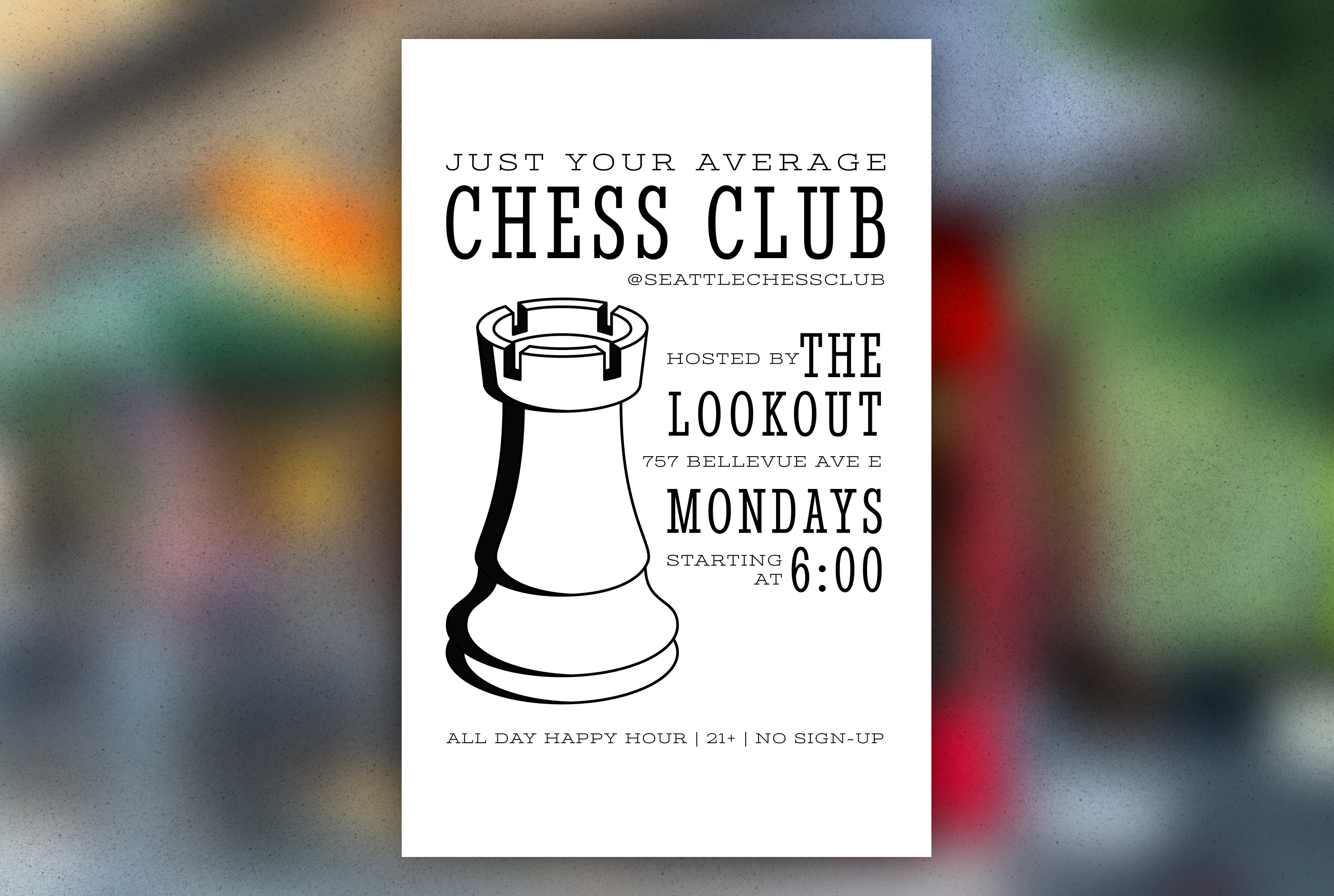
The poster design was a huge success. The group grew quickly and most of the new-comers told us that they found out about the event from the posters. They had more people coming to play chess every Monday at The Lookout than they ever had before the pandemic started.
Developing a System for Expansion
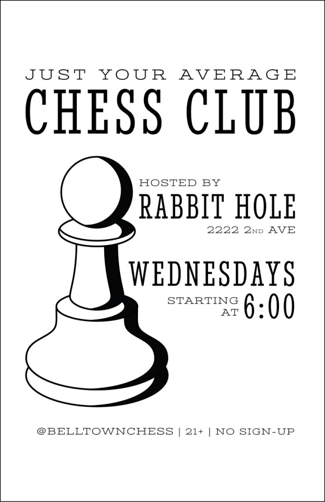
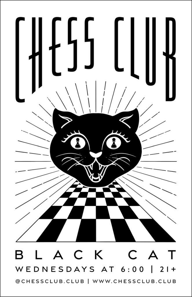
When the popularity of chess grew, The Lookout was getting too crowded each week. To reduce the pressure, they added another night in Belltown on Wednesdays. I illustrated a pawn for this poster to make it clearly different from the Capitol Hill poster, but kept the typography as similar as possible. The original location was The Rabbit Hole, but the bar sadly closed down a few months later. The Belltown night was then moved to The Black Cat. I wanted to have brand recognition, so I changed the pawn to black to avoid confusion.
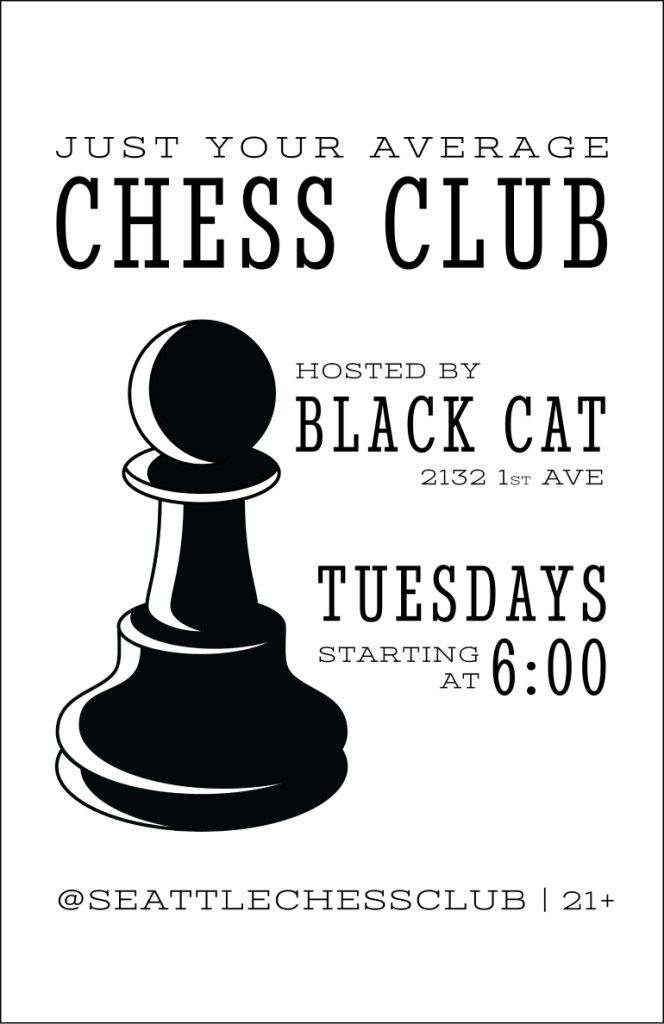
The Belltown location became popular, but the Capitol Hill location continued to grow. Monday nights moved to Linda’s Tavern, as there is more seating. I created a poster to notify people that the Monday night location was changing. Around this time, we also added another location in Ballard at King’s Hardware, another bar owned by the owner of Linda’s Tavern.

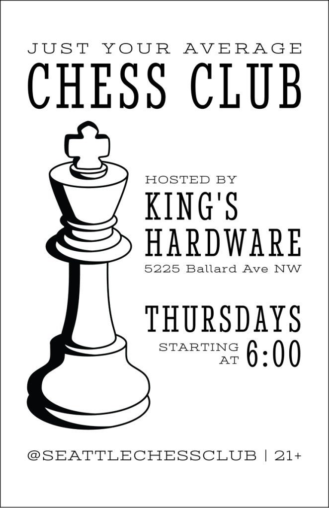
When there were three clubs, I started designing a custom poster for each of the locations. We thought it would be good to capture the personality of the different bars with unique designs, while keeping some elements the same for consistency.
I created custom typography for each poster but I fit the titles into arched shapes on all of the posters to create a visual thread. The event details have different variations for different locations, but I put them at the bottom in all of the design to keep the layouts similar.
When we added a location in the University District, we made a poster following the original design conventions first because we knew the style was recognizable to existing chess club regulars. Once that poster had the chance to be seen for a few weeks, we refreshed it with a custom poster to pique the interest of potential new members. Big Time Brewery was the first venue that allowed minors, so the event details were a little different.
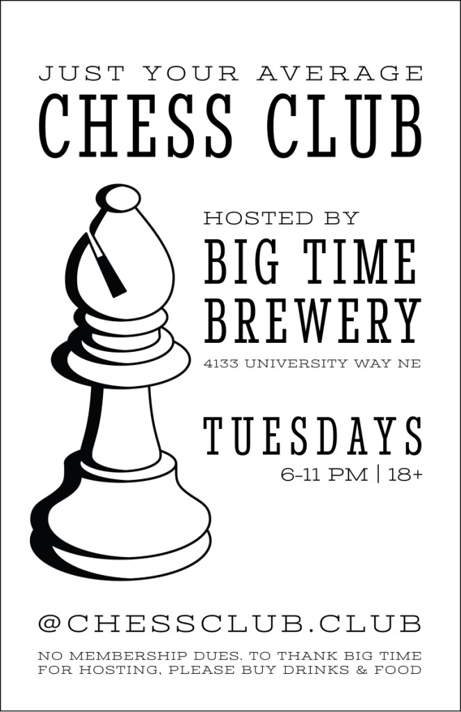

The Big Time Brewery chess night quickly turned into the most popular night for advanced players and it being all-ages was a contributing factor. This was the impetus to start two family friendly chess nights on opposite sides of the city.
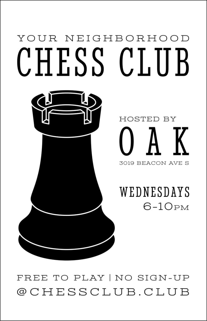
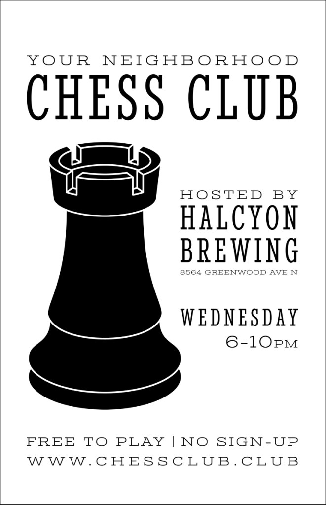
The new clubs were at Halcyon Brewing in Greenwood and Oak in Beacon Hill. These neighborhoods do have foot traffic, but not as much as the other areas, and postering is less common in these neighborhoods. For this reason, only a few posters would be put up in strategic places instead of all over the neighborhoods. Since fewer posters would need to be printed and they were also meant to catch the attention of families, in addition to adults, I designed the custom posters in color.
Introducing Color
I had used a combination of Adobe Illustrator and Procreate for iPad Pro for all of the custom posters, but I took a slightly different approach to these. To give it a more hand-drawn and friendly feel, I only used Illustrator for the event details and did the chess club lettering and illustrations in Procreate.
Halcyon Brewing
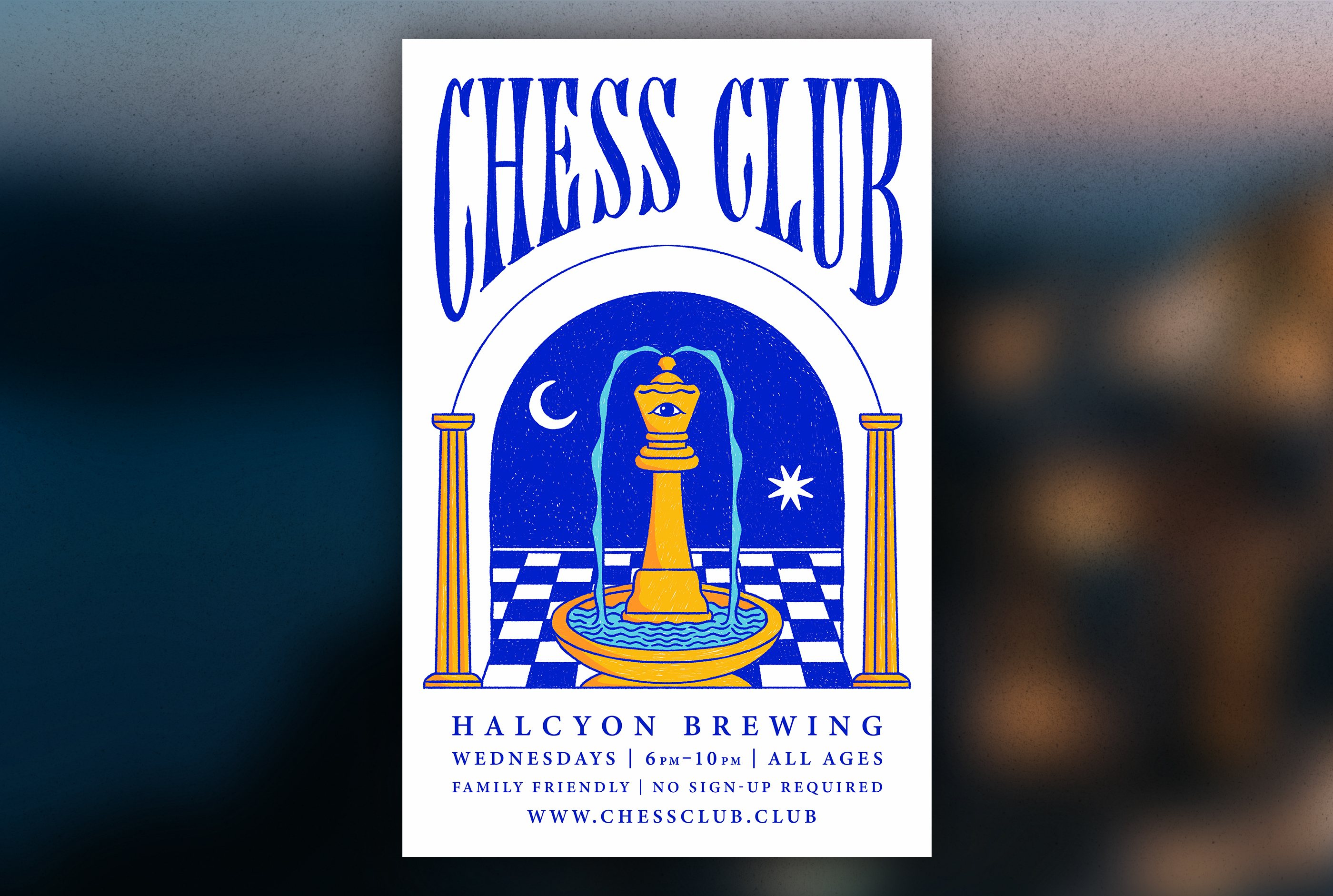
The name Halcyon refers to a woman in a tragic love story in Greek Mythology. The ocean plays a large part in the story. I chose the queen because Halcyon is a woman, I made it a fountain to reference the ocean, and I added columns to reference the Greek origin. The patio at Halcyon Brewing has a large mural in a bold folk art style, so I chose bold contrasting colors and relatively simple shapes.
Oak
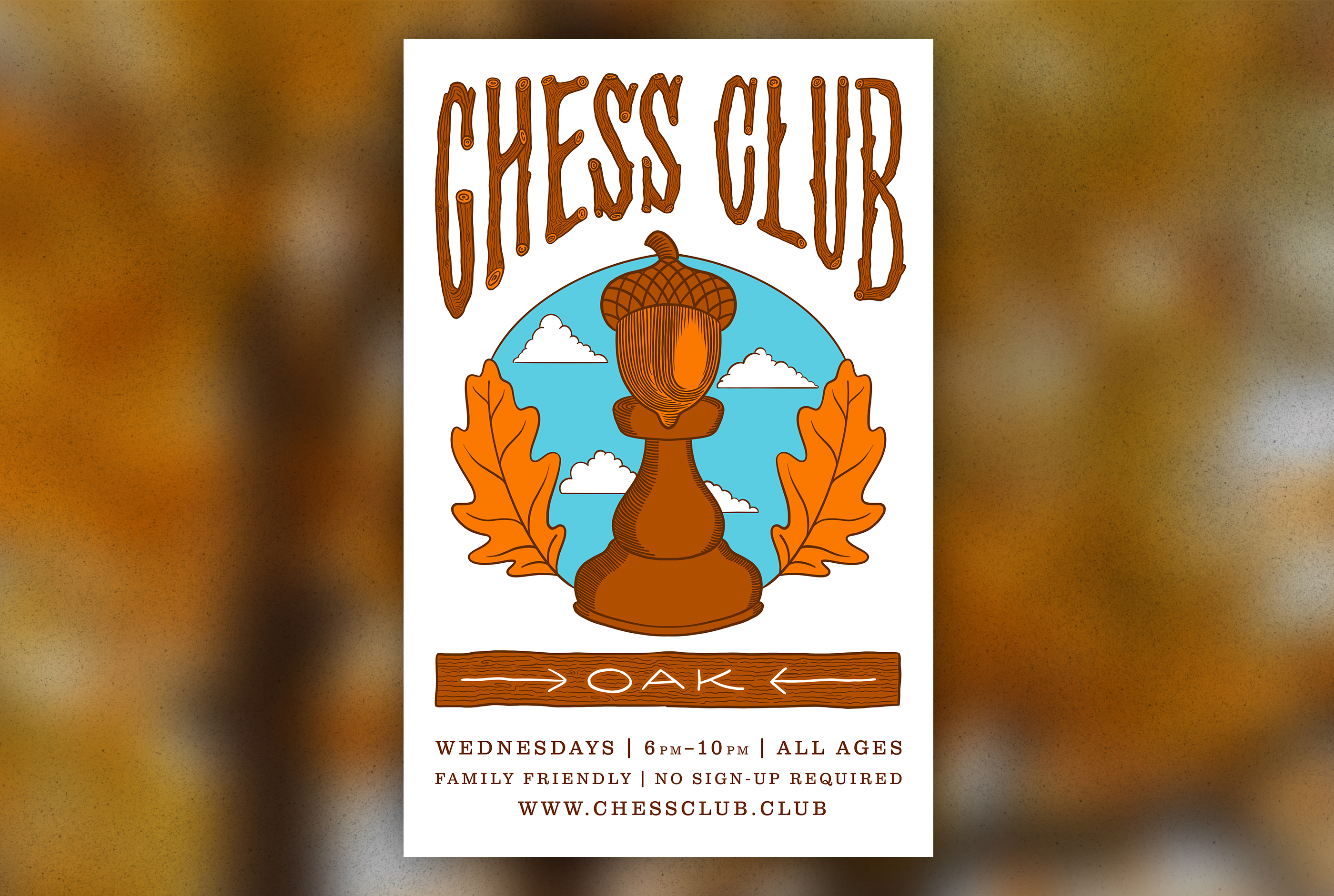
Oak is a cozy bar that feels like being in a cabin. I illustrated the lettering of Chess Club to took like a vintage sign they have in the bar. There are also murals inside that look like paint by numbers, so I wanted to have bold blocks of color. I made the top of the chess piece an acorn and added oak leaves to frame the illustration.
After the color posters got a lot of positive attention, we decided to make color posters for the other clubs as well
Linda’s Tavern
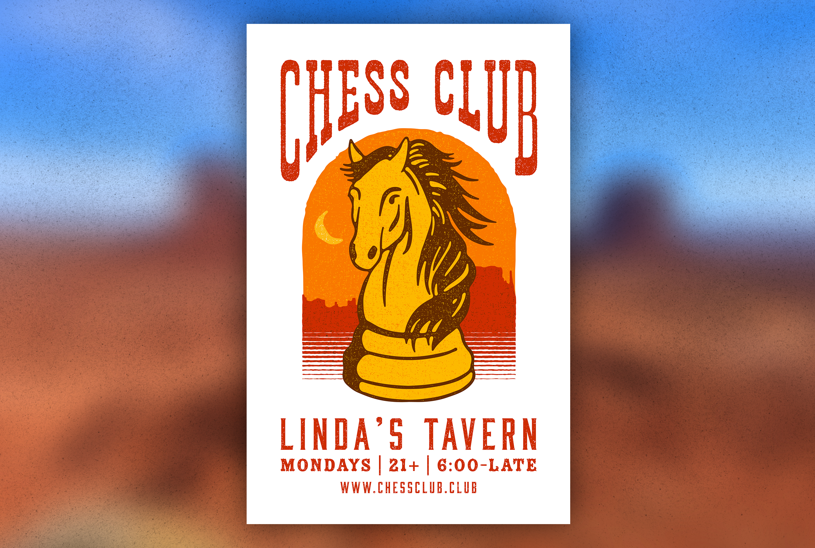
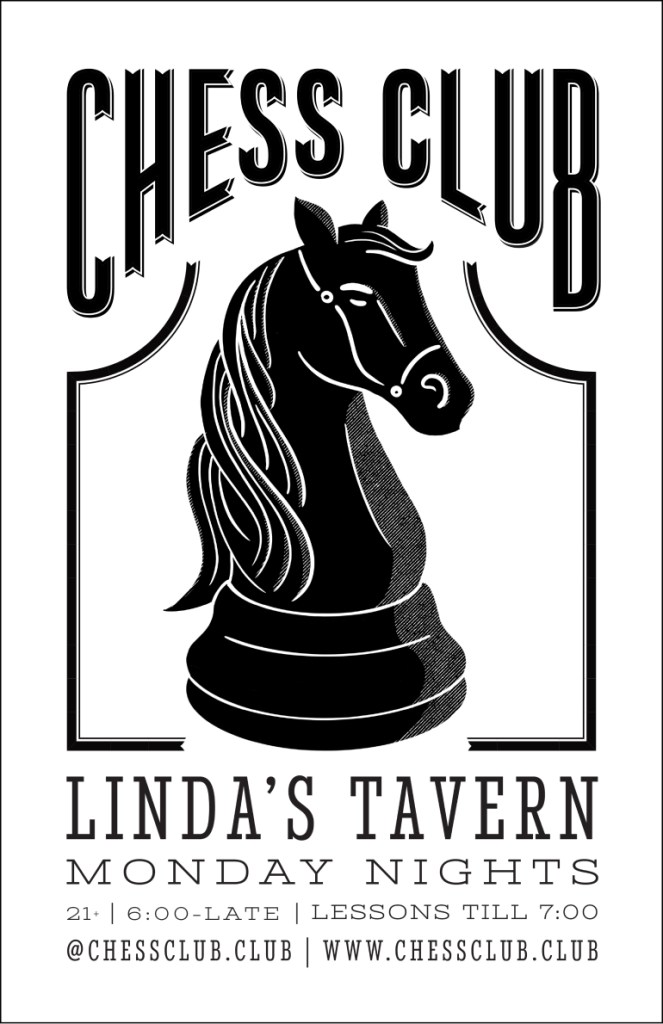
Linda’s Tavern is a bar with an old west aesthetic and a history of being associated with the Seattle music scene. Framed screen-printed music posters were one of the inspirations for this poster. The Linda’s logo of a bucking bronco made choosing the knight as the symbol an obvious choice. I created this design in Adobe Illustrator. Once the layout was set, I applied a series of filters to give it a more hand drawn and printed effect. We simplified the information on this poster to be more eye catching. Capitol Hill is a highly postered neighborhood, so getting information across quickly is a priority.
King’s Hardware
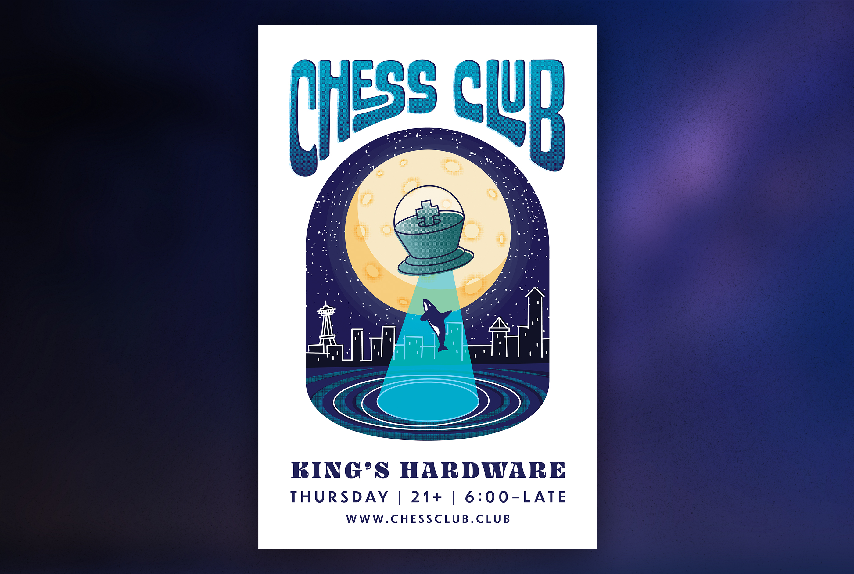
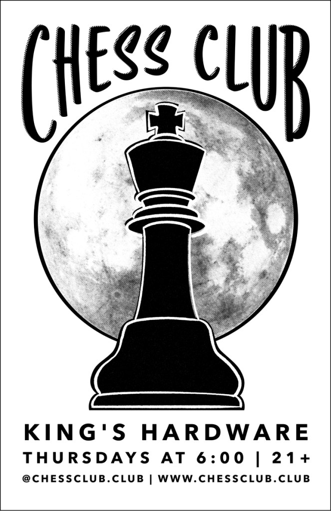
King’s Hardware is a bar in the Ballard neighborhood with the same owner as Linda’s Tavern. The interior design in King’s is very similar to Linda’s so I didn’t want to draw on it for inspiration, as it would result in a very similar poster for a very different audience. Ballard is positioned on Puget Sound, making the water a big part of the culture. When I looked at the king chess piece, I envisioned the top as a flying saucer beaming something up from the water. The classic animal to get abducted is a cow, so it seemed fitting to choose another black and white animal. Orcas were also a common sight in puget sound during the 1960s, which is the era I emulated in this design. This sci fi aesthetic felt like a good direction for the Ballard crowd, as the neighborhood is known for people who are a little bit older with niche interests.
Big Time Brewing
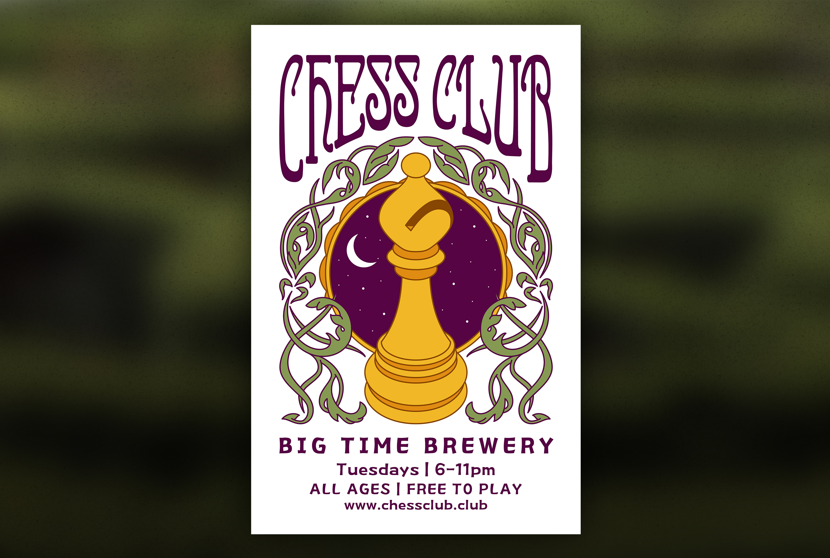
Big Time Brewery has been open since 1988, but the building has a much longer history. The turn of the century architecture is only one reason I opted for an art nouveau style for this poster. Their back seating area has several vintage beer posters with early 1900s style imagery, some of which look old enough to be from when the bar opened as Seattle’s first post-prohibition brewpub. Choosing the bishop as the symbol also has historical roots. In ancient Indian and Persian versions of chess, the bishop piece was an elephant. It was changed to a bishop when chess was introduced to medieval Europe. Some savvy players have noticed the connection between Big Time’s elephant logo and this piece of chess trivia.
Blacklight Chess Parties
In addition to weekly chess nights around the city, Chess Club also hosts periodic events known as Club Chess. All of these events are later in the evening and involve blacklight chess. Black lights are set up around the chess board area, and instead of playing with white and black pieces, players use neon orange and green pieces. This along with the live DJs create more of a “club” atmosphere.
First Art Show
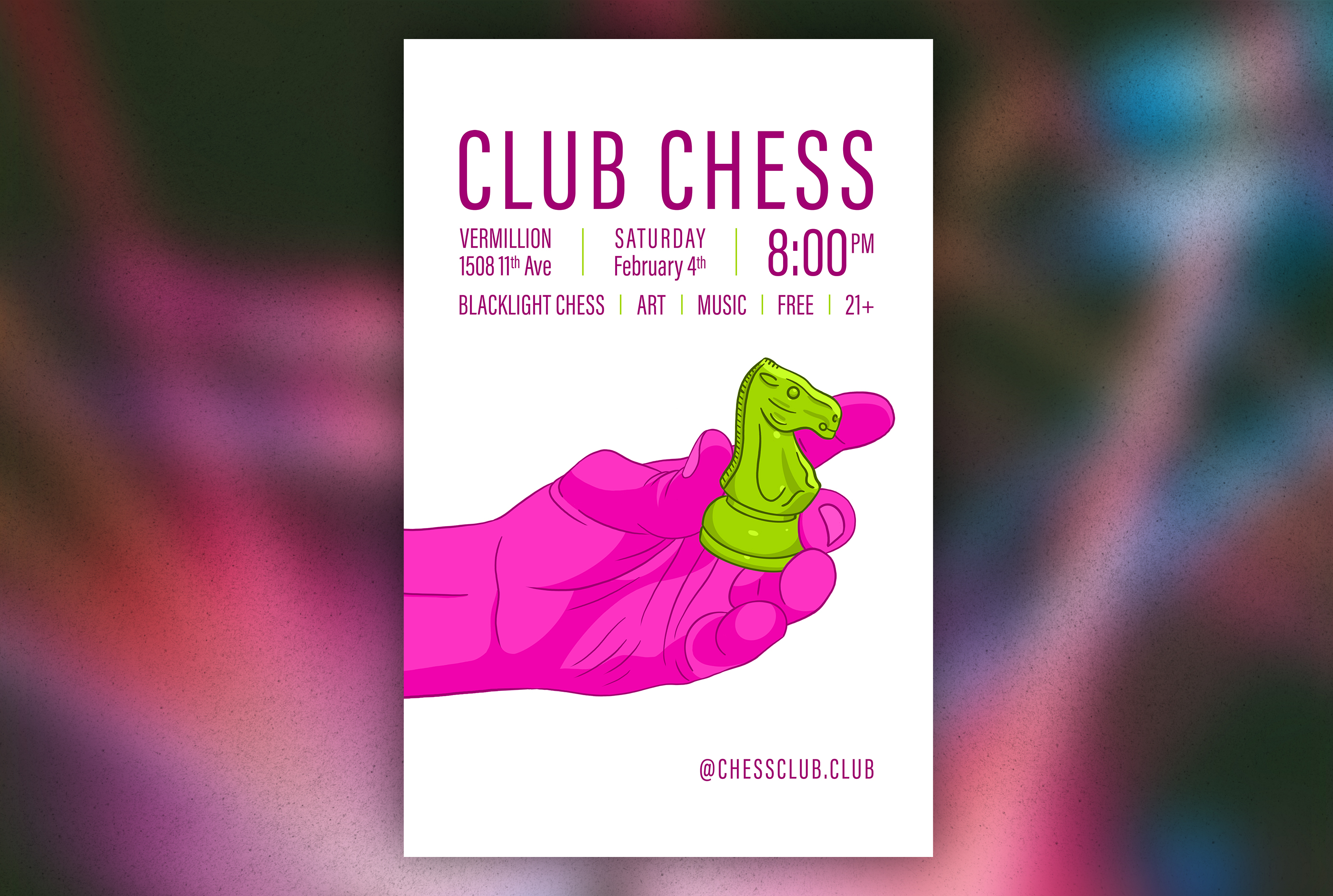
The first of these events that I created a poster for was an art show at Vermillion that I also helped to curate, and participated in. This was an interesting artistic challenge because the art needed to look good in both black light and regular light. The art pieces I created for the show are digital illustration of hands holding chess pieces over warped chess board background patterns.
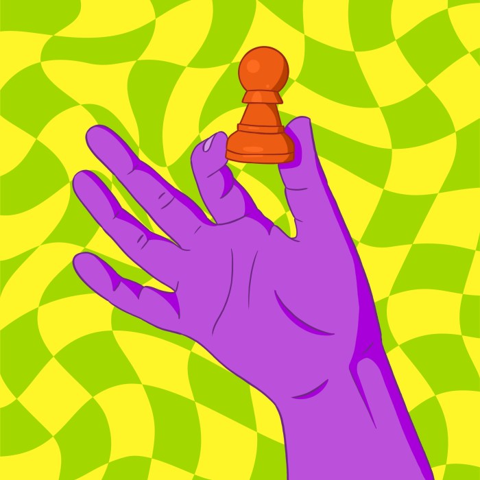
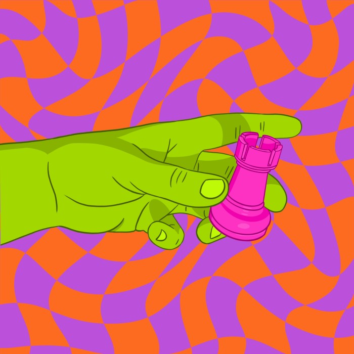
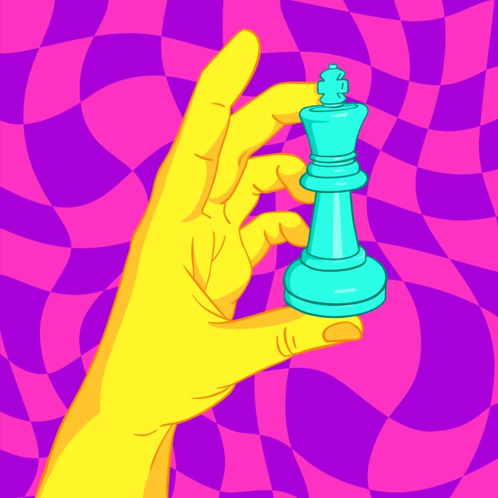
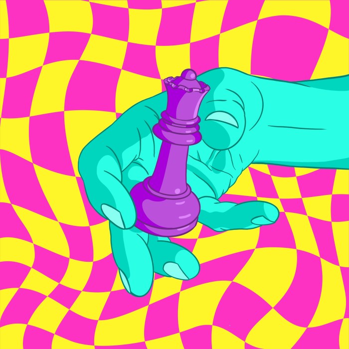
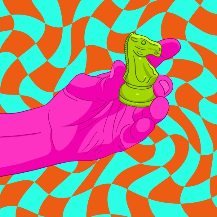

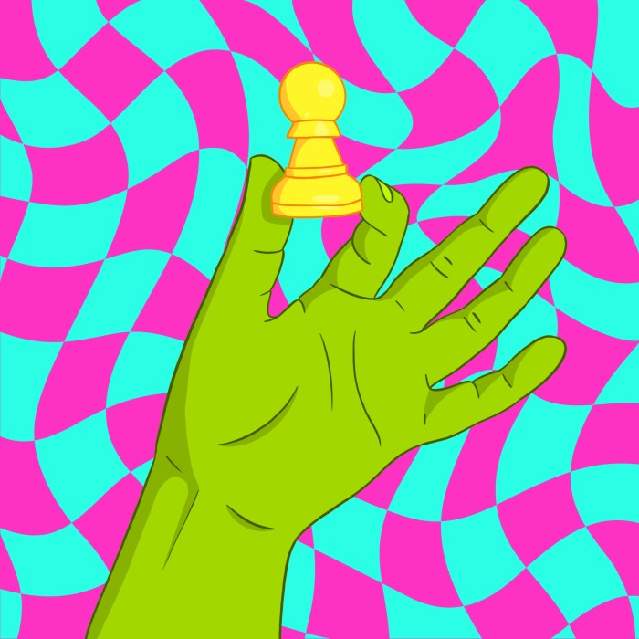
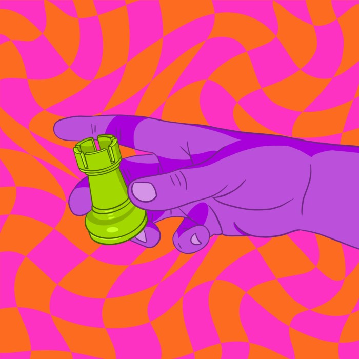
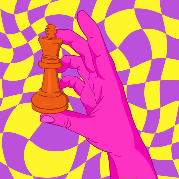
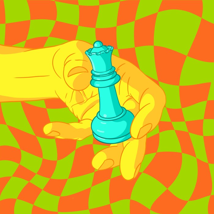
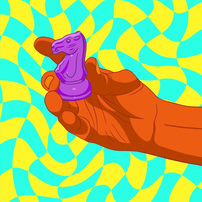
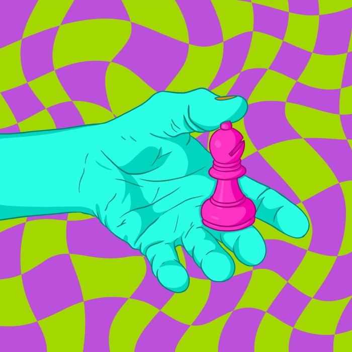
Half of my prints were installed in normal gallery light, and the other half were installed in the blacklight chess area.
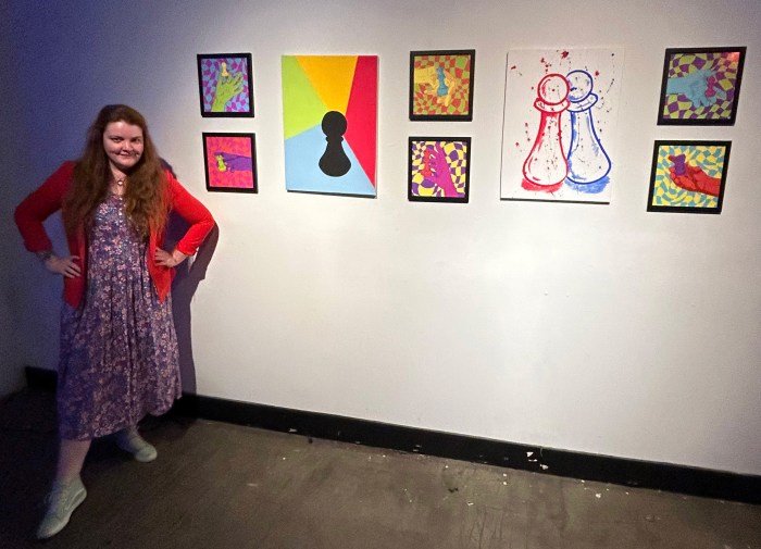
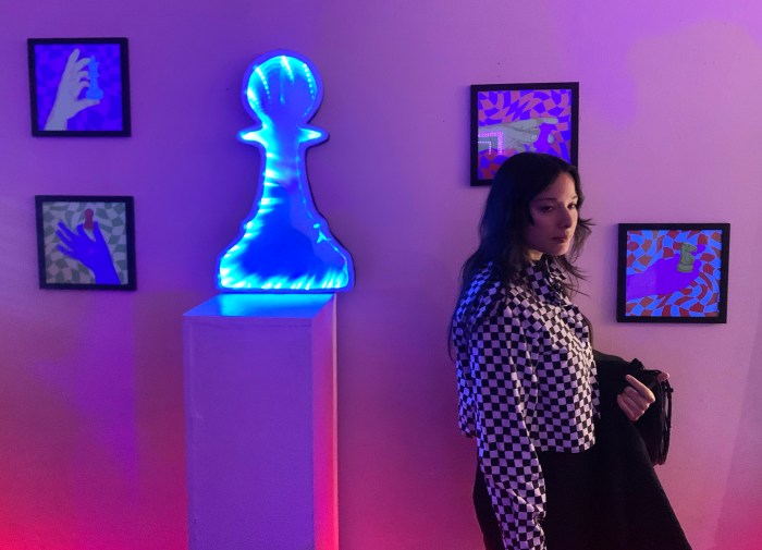
This was a great experience in design, art, and curation. I worked closely with the other artists to produce work that would fit well together in the gallery setting.
I did test prints to see which color combination looked best on a white background and selected an illustration for the poster.
Pride Art Show
After seeing the results of the first art show, we scheduled another show at the same location for the beginning of June. I was tasked with curating this show on my own, so I made the choice to make it Pride themed. I invited a number of artists and tried to select as many artists as I could from the LGBTQ+ community.
For this show, I only contributed one piece to focus more of my effort on design and curation. One of my friends, DonnaTella Howe, is a popular Seattle drag queen, so I asked her to model for an illustration that I used in my art piece and for the poster design.
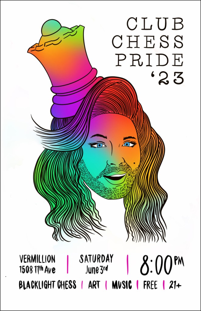
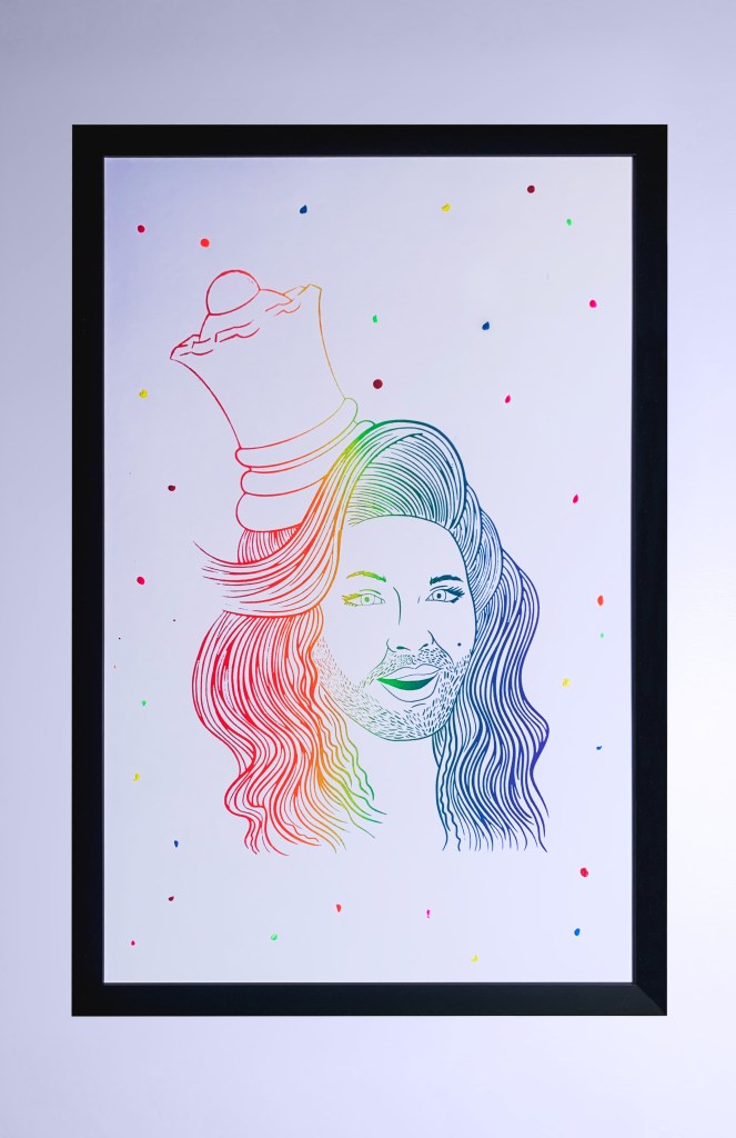
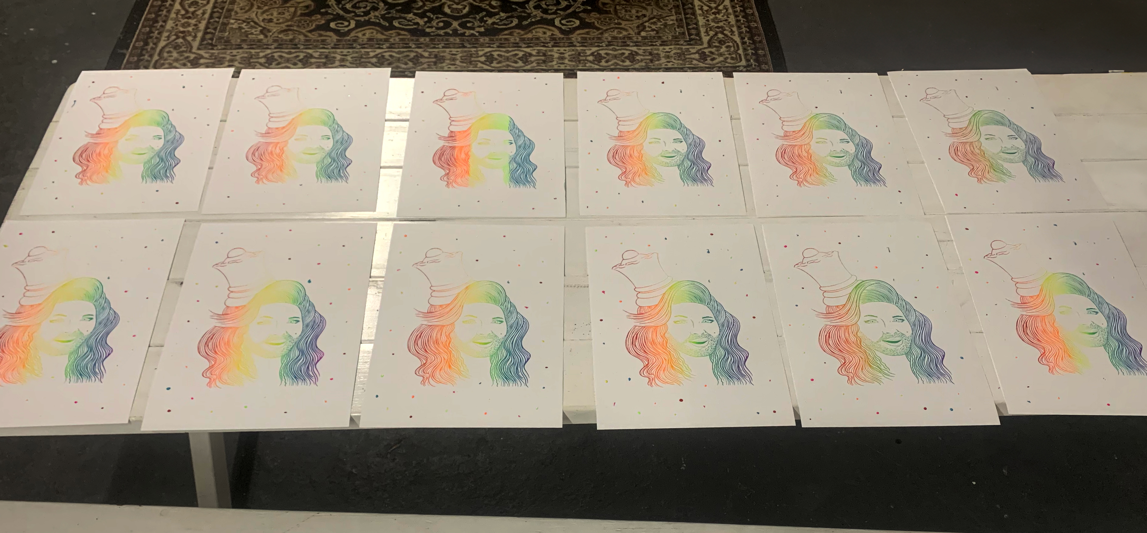
I did the illustration and lettering for the poster in Procreate and then created the rainbow gradient fill in Photoshop. The piece I included in the show was a screen print that I printed in my studio. I did a run of 18 prints with the rainbow gradient and added the dots in the background to fill the space and make each print unique.
Linda’s Halloween Party
In 2023, Halloween was on a Tuesday, so chess club turned the regular Monday night Chess Club into a party the day before. There was blacklight chess, DJs, and a new poster design.
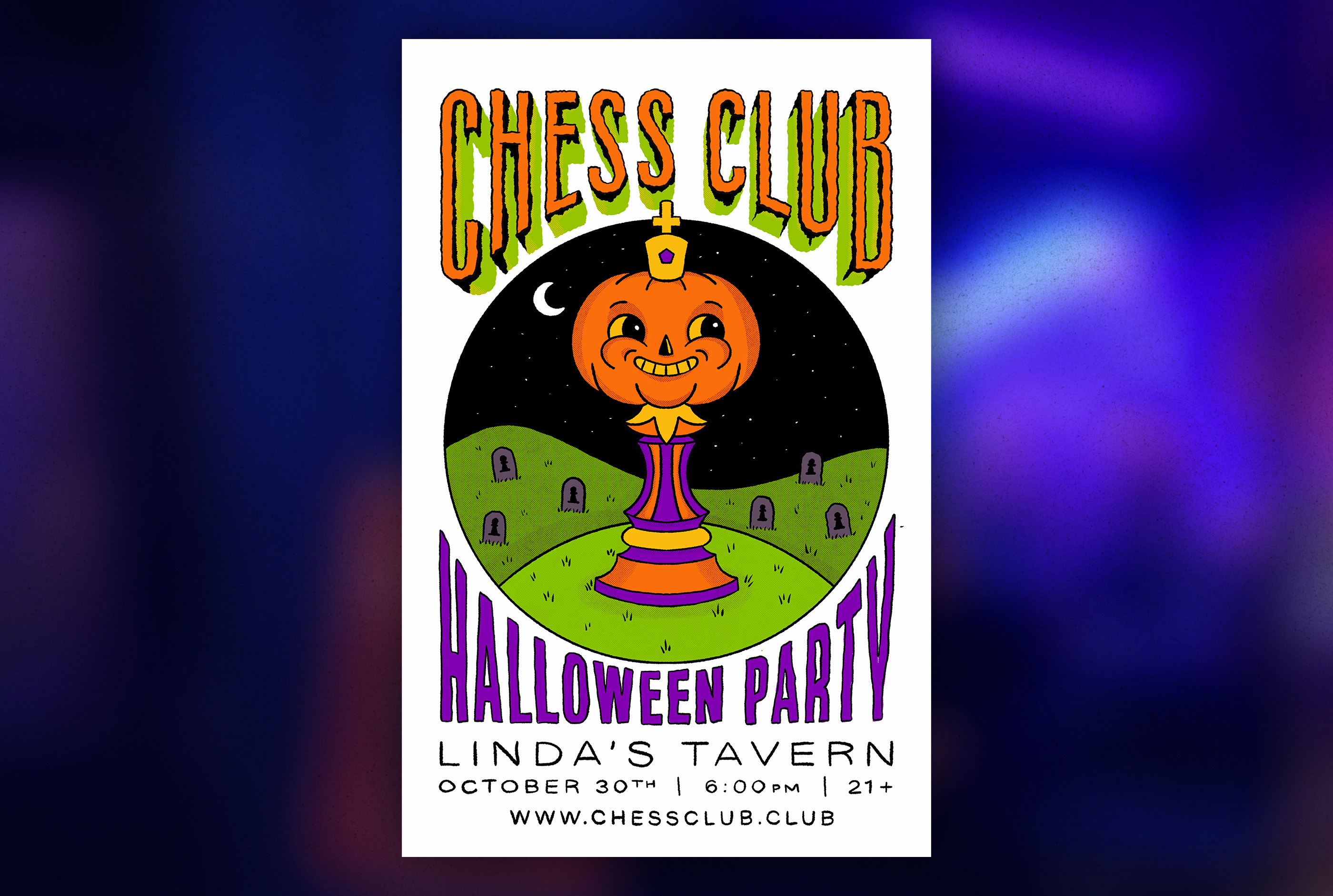
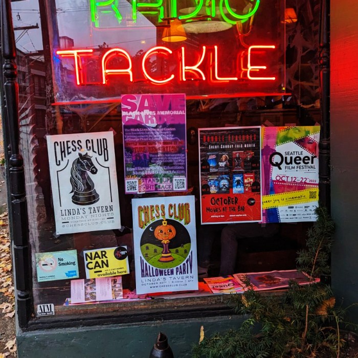
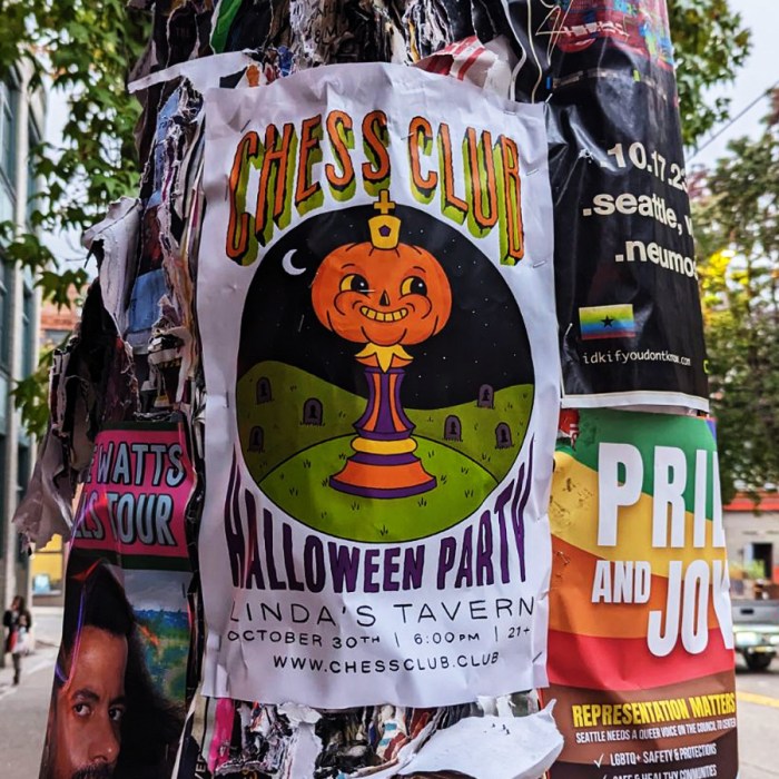
I illustrated the whole design in Procreate. Two characteristics of the Linda’s Tavern design aesthetic are edgy and vintage. I was inspired by vintage halloween decorations.
Linda’s Anniversary Party
January 22nd, 2024 was the 2nd anniversary of the Capitol Hill Chess Club moving to Linda’s Tavern, so they threw a party and I designed a poster.
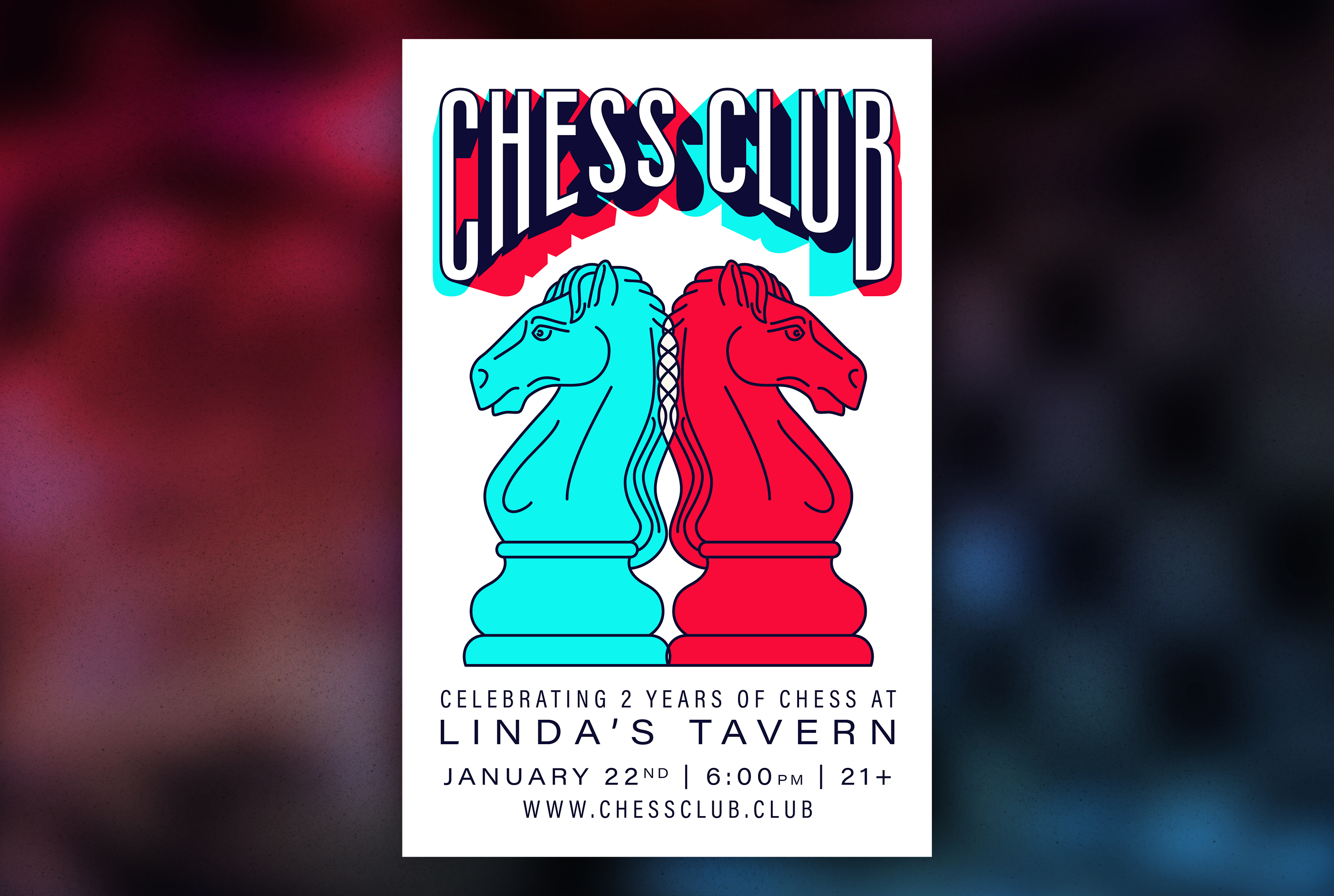
I wanted to do a design with two of the same piece for the two year anniversary and the founder wanted a 3D glasses inspired color scheme so this design’s development was a logical progression.
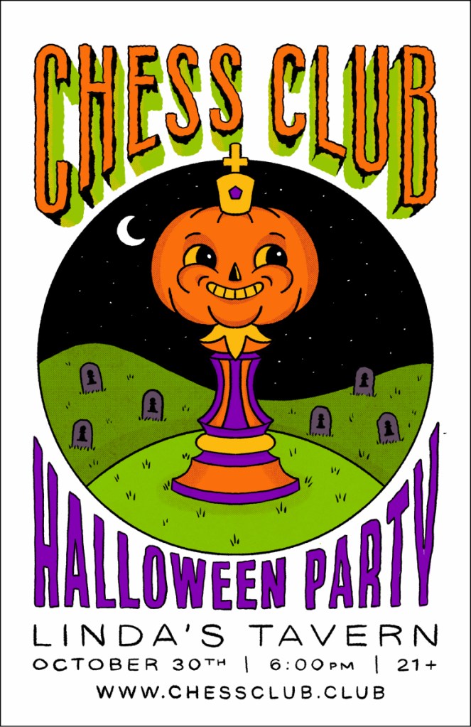
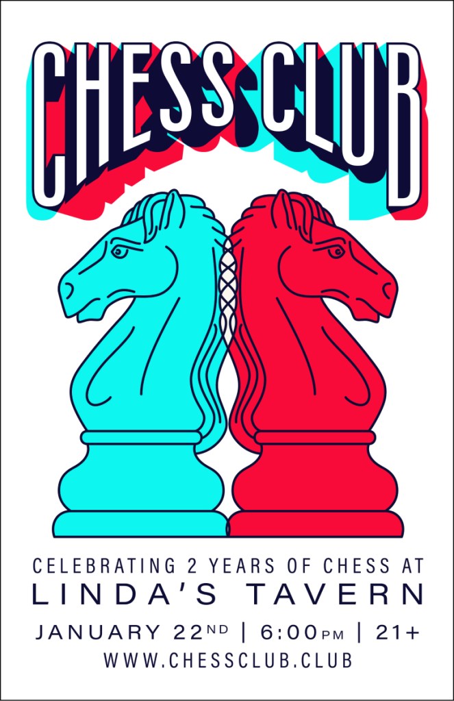
I based the typography for this poster of the typography I created for the Halloween party to have a visual connection without making it look like a template.
Sixth Anniversary Party
When the 6th anniversary of Chess Club was coming up, we worked with the bar to have some menu specials to celebrate. When I saw that they had three $6 specials that we wanted to put on the poster, it made me think of 666.
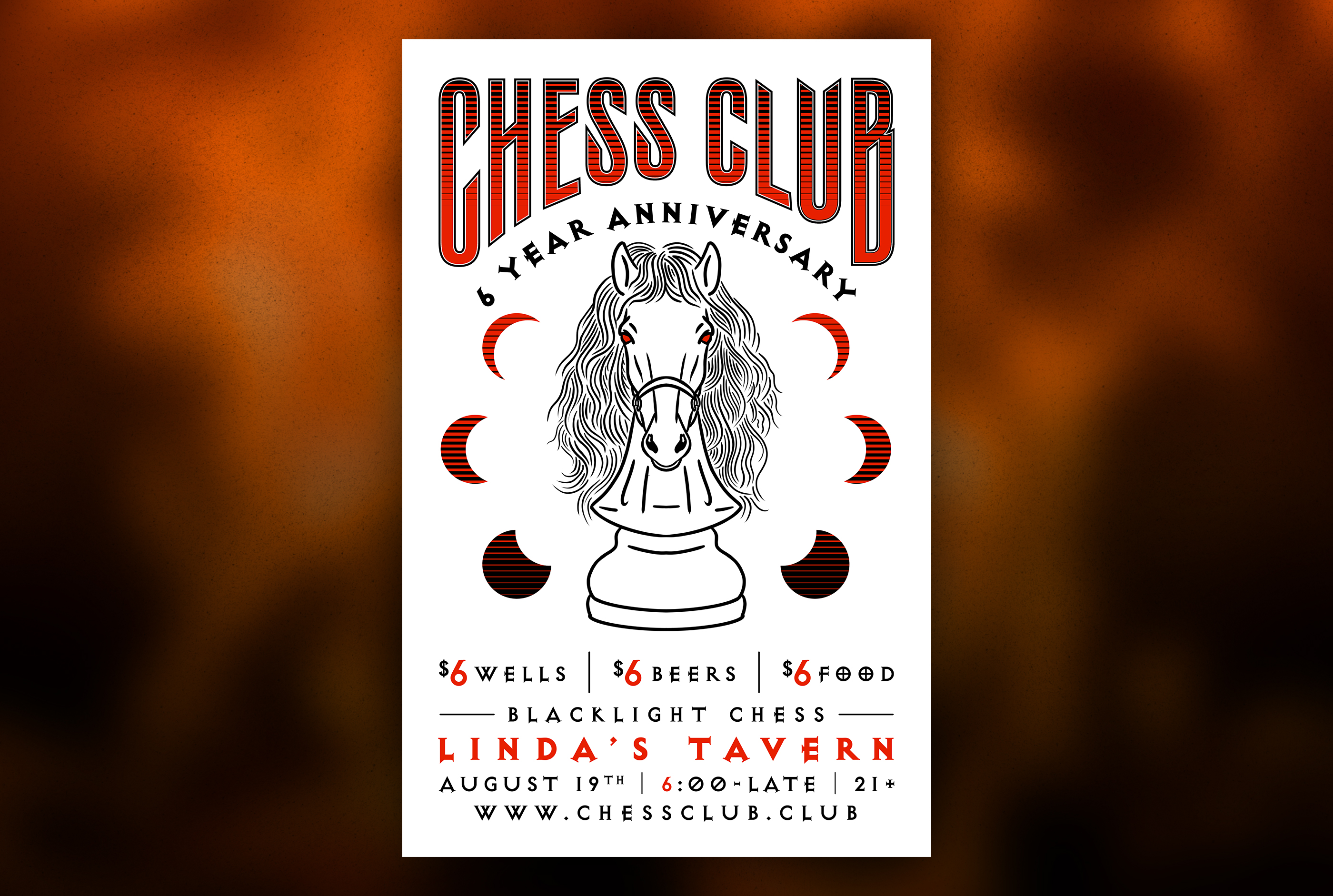
With the moon symbolism that we incorporate into most of our designs and the fact that metal music is often on the stereo at Linda’s Tavern, the satanic motif made a lot of sense. I did not, however, want the poster to look too scary. I also took inspiration from 1980s hair metal with the retrowave fill on the text and moon. I illustrated the knight in procreate with a hair band inspired mane.
Chess Disco
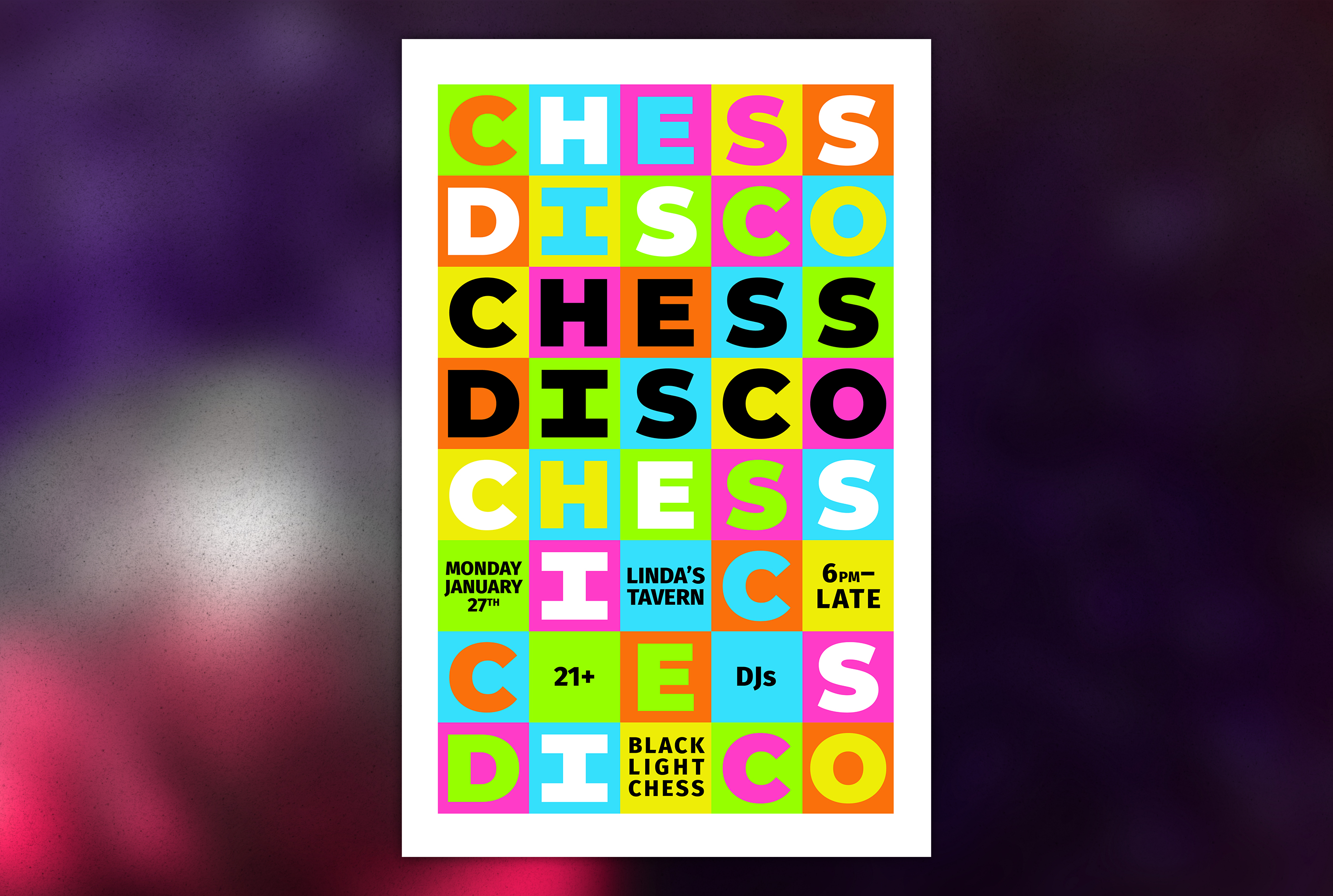
Chess Disco was a disco themed Club Chess night at Linda’s everyone dressed up in disco outfits, DJs played disco music, and players played blacklight chess. I designed the poster based on the iconic light up disco floors. I repeated Chess Disco down the page to reference pop art themes and removed letters in a triangle pattern to add the details.
Tournaments
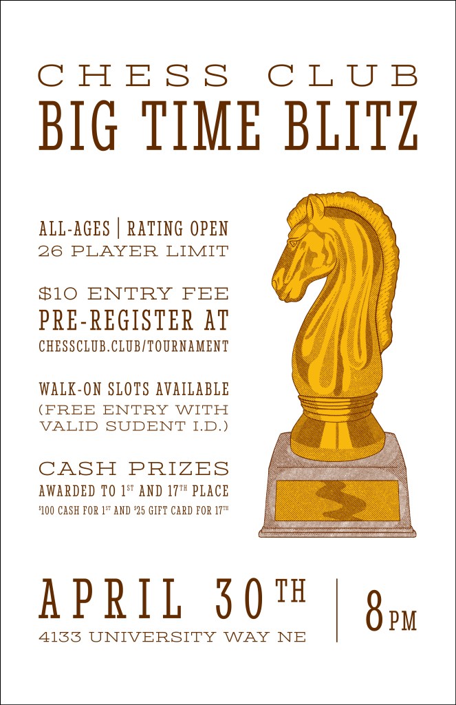
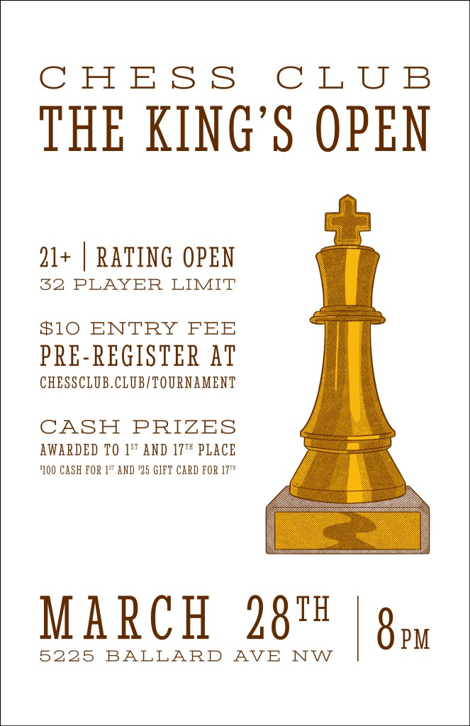
Chess Club has regular tournaments at Big Time Brewery and King’s Hardware. Trophies are awarded to the winners of each, a king at King’s and a knight at Big Time. I created templates to promote these tournaments including illustrations of the trophies. I illustrated the trophies in procreate and created hatched shadows with halftone line texture and masks to give them a vintage print aesthetic.