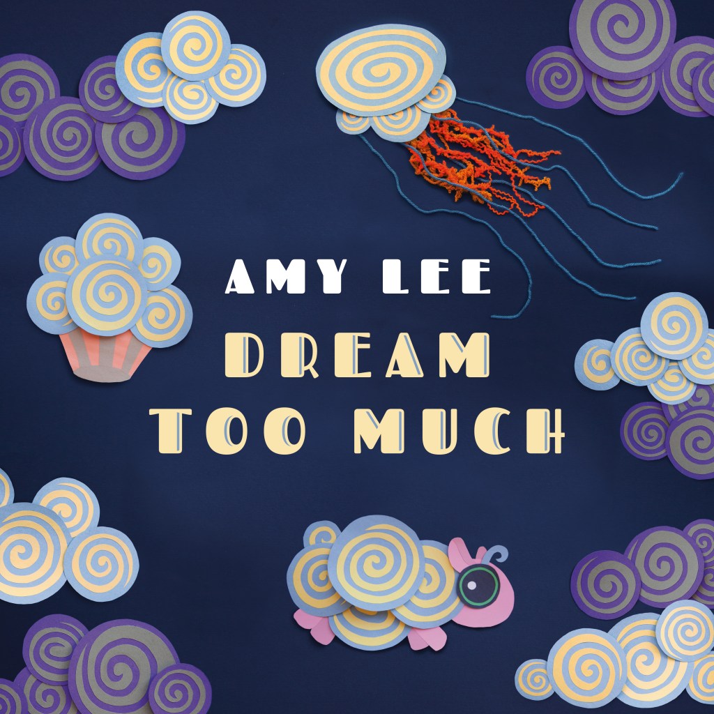
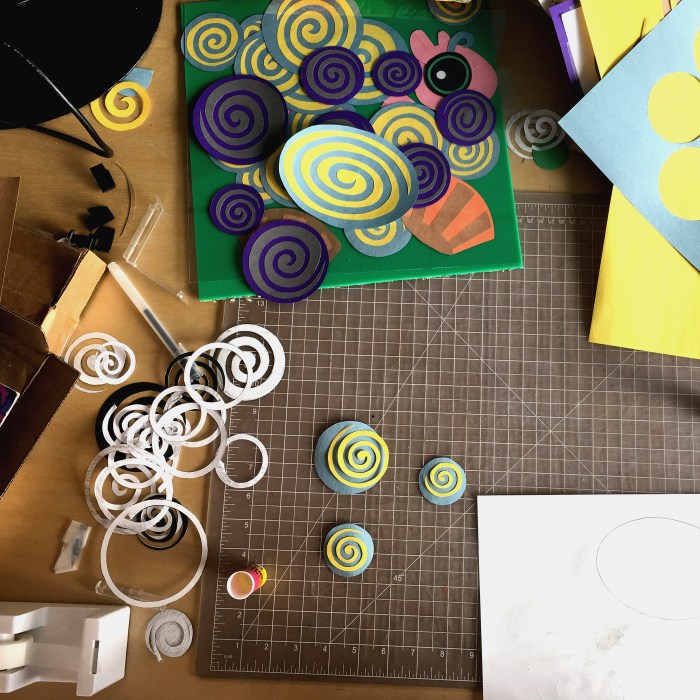
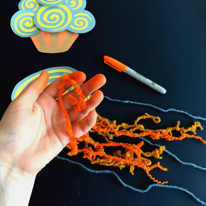
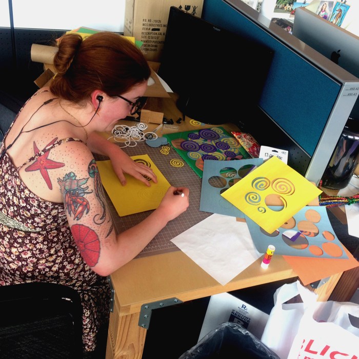
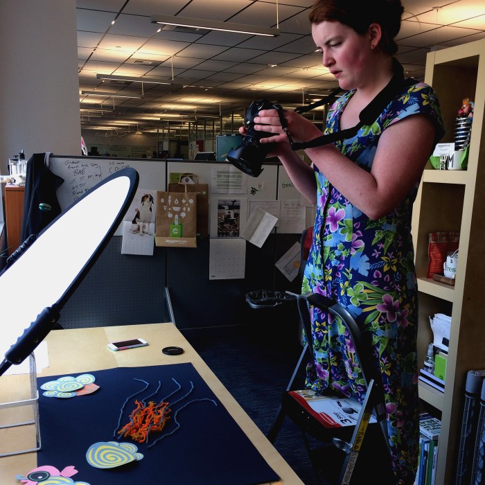
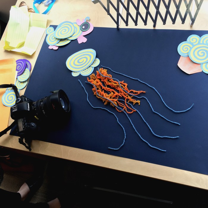
In September of 2016 Amy Lee, the lead singer of the band Evanescence, released a children’s album through Amazon Music. By the time I was brought in to design the album cover and CD packaging, videos for each song were already in production. These videos were animated to look like construction paper cut outs based on art created by Amy Lee. I was shown her art as well and was inspired by a painting of clouds, one of which had a head and legs to make it look like a little sheep. I listened to the album and picked two more items that are reminiscent of clouds, a muffin and a jellyfish. In keeping with the aesthetic of the videos, I physically cut all of the shapes out of construction paper and glued them together with glue sticks, which I knew would warp the paper and give them a more three-dimensional appearance. I photographed them instead of photo copying them to retain that dimensionality. The tentacles of the jellyfish were made of yarn, some of which I hand dyed with sharpie to create variation in the color
CD Packaging
The album was released on CD, so I did some additional fun graphics for the packaging.
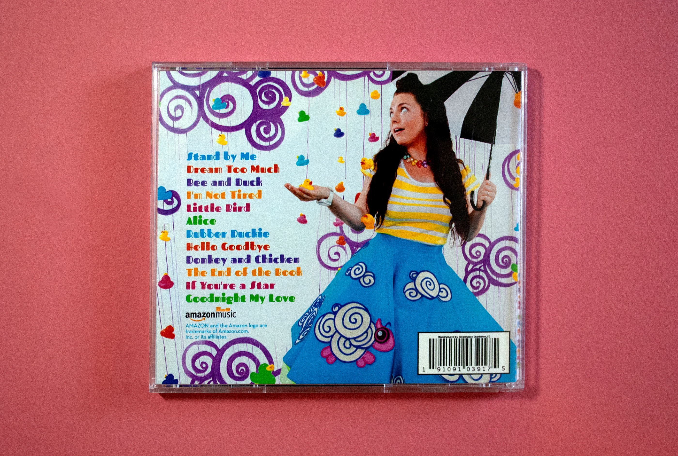
Amy Lee made a skirt and backdrop based on the cover art and did a photoshoot, so I used one of the photos at the back cover. I used the bright colors of the rubber ducks on other design elements in the packaging to brighten up the color scheme.
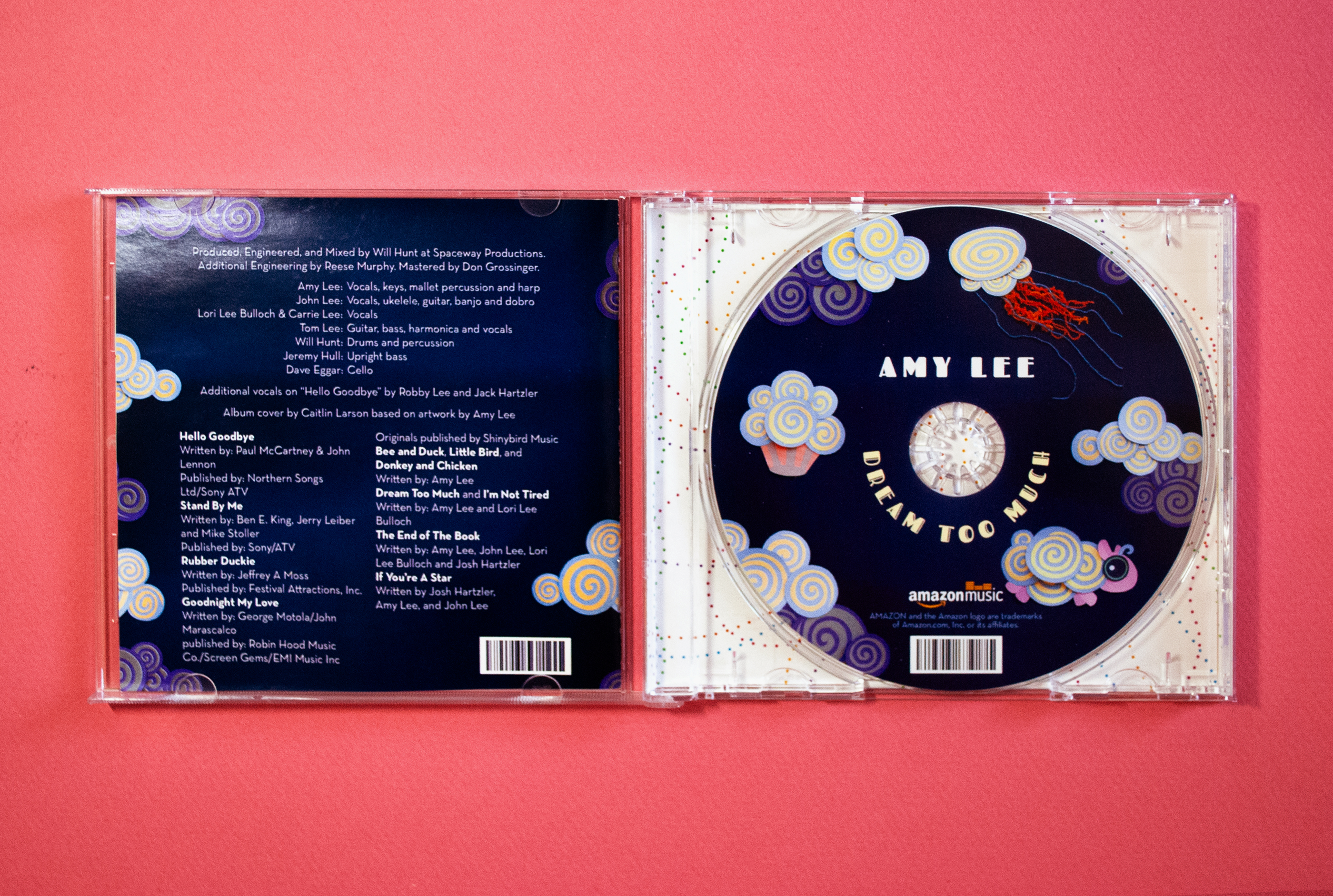
The design on the back cover of the booklet is a continuation of the cover art. I like to do this on all of the CD packaging I design to avoid a sliver of the back design showing on the front if the printing registration is slightly off. I made the CD match the cover to have contrast against the white back plate and make it easier to visually match the CD to the album art.
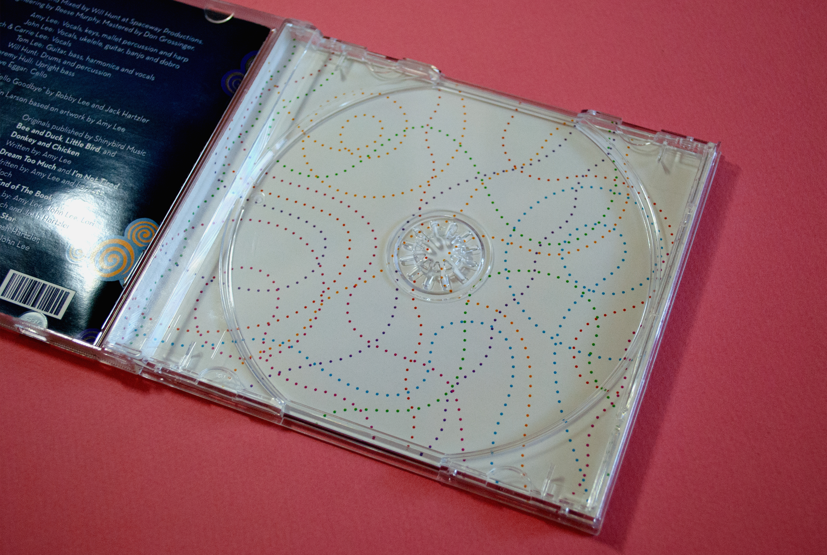
I made the back plate a bright colorful pattern to tie in bright colorful design on the back. I also use some of this design system in the booklet.
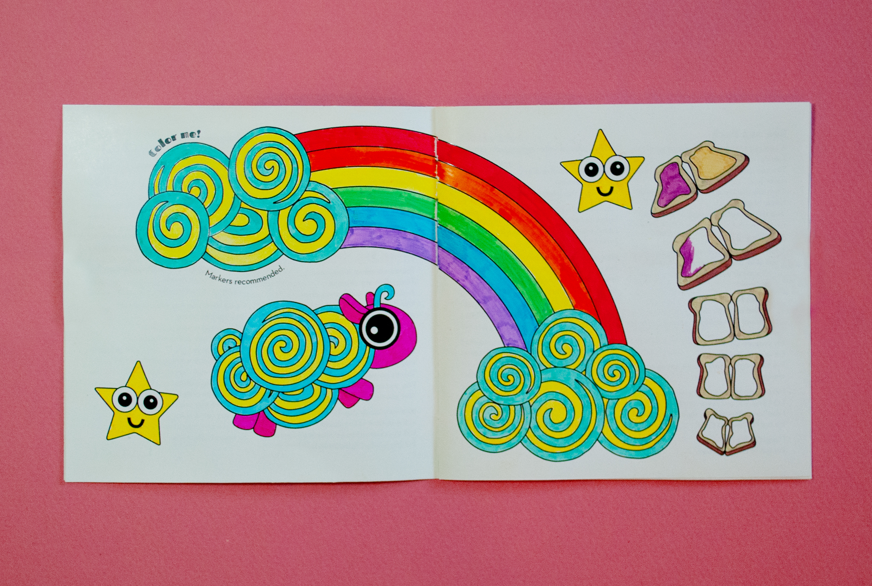
On every other spread of the booklet, I illustrated a coloring book spread as an activity for the kids, built into the CD packaging.
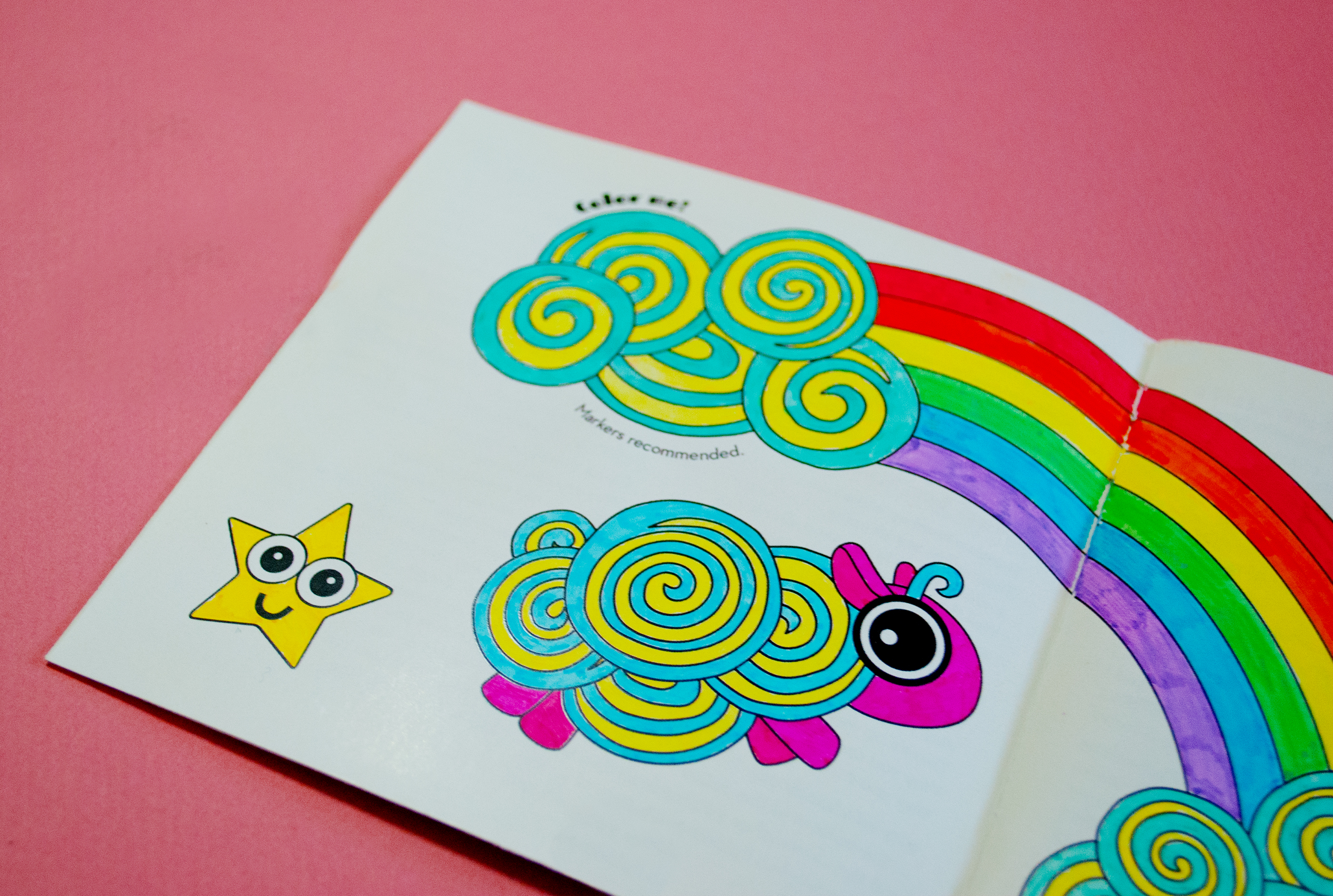
I tested several different types of markers on these and they all worked well. The heavy glossy paper minimized the ink bleeding through.
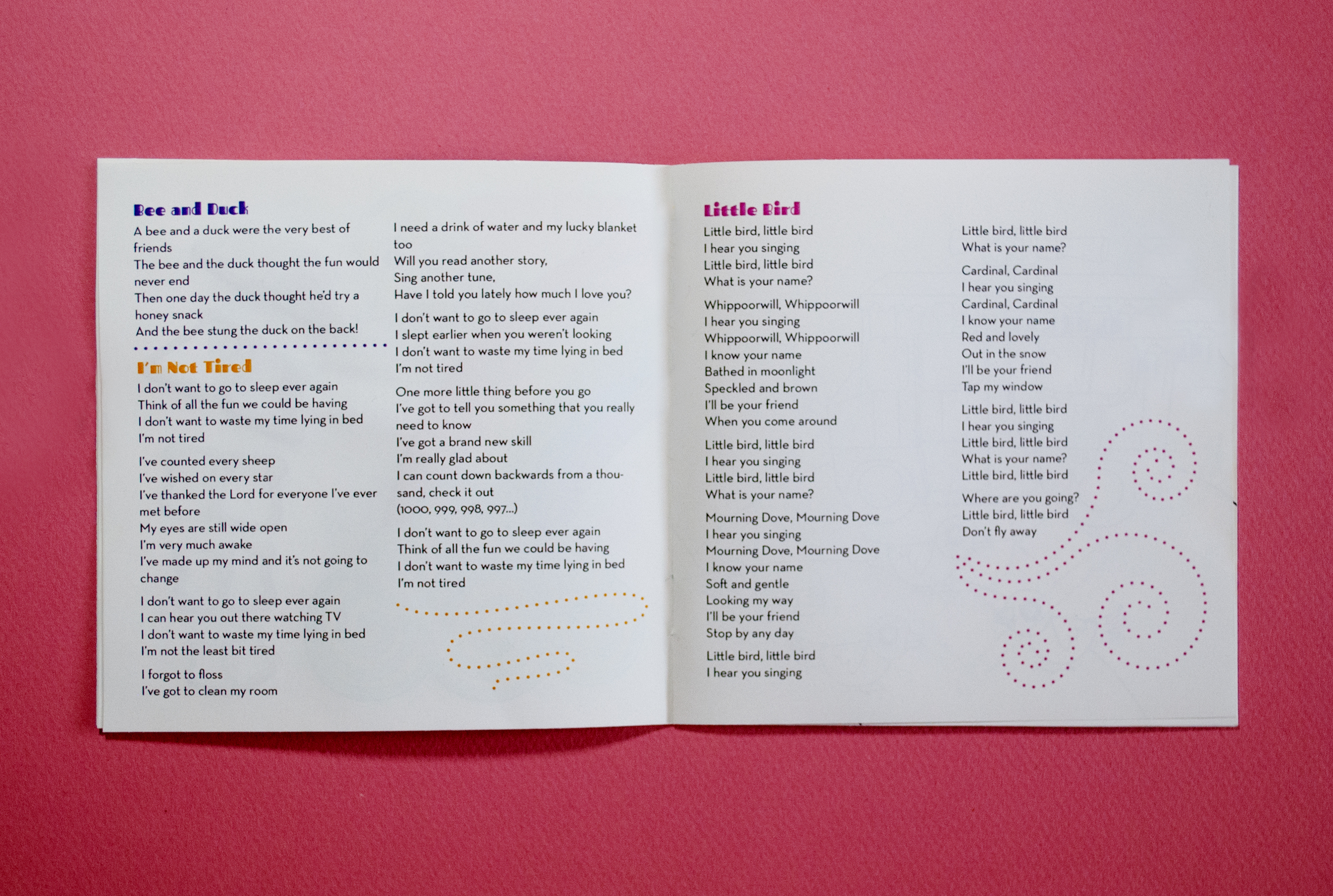
Many of the songs were very short, so I could fit multiple songs into one spread. I just made sure that they didn’t have to break to a new page. I made dotted line shapes, like those on the backplate, to fill in the negative space.
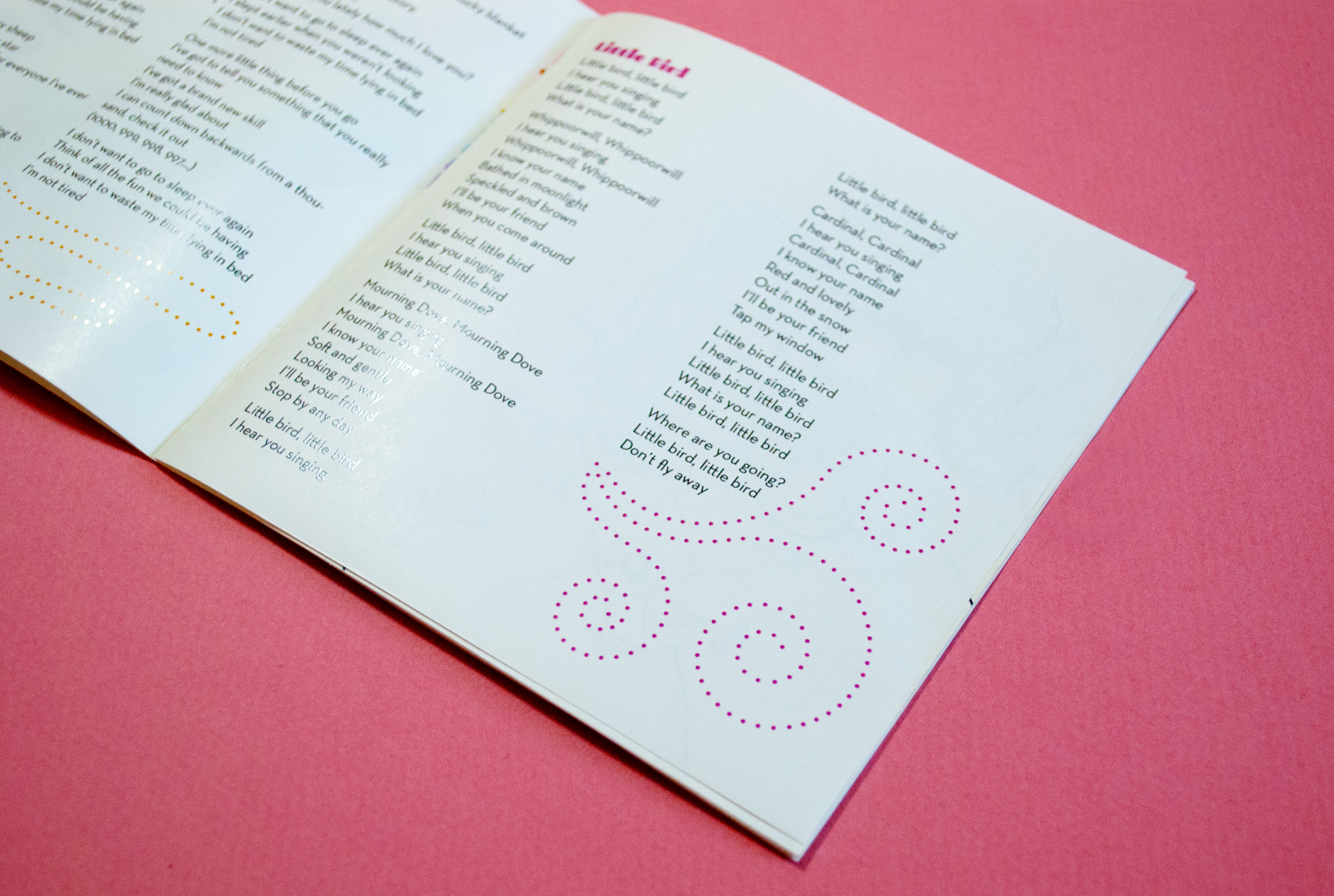
I wanted to include designs on these pages, while still keeping a lot of breathing room, so these abstract shapes were a good solution.

