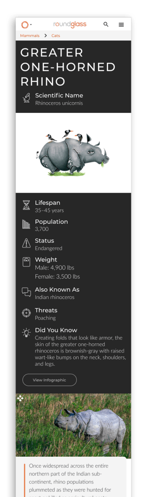
The Sustain Collective has a collection of hundreds of stories about India’s wildlife and habitats. There are many species that have a few different pieces of content about them. If users searched for a species, the results page was a very generic listing page of related content. The Sustain team came to me to design a layout for a dynamic search result page for species that could be generated with minimal input from their content creators. You can view a full page preview here.
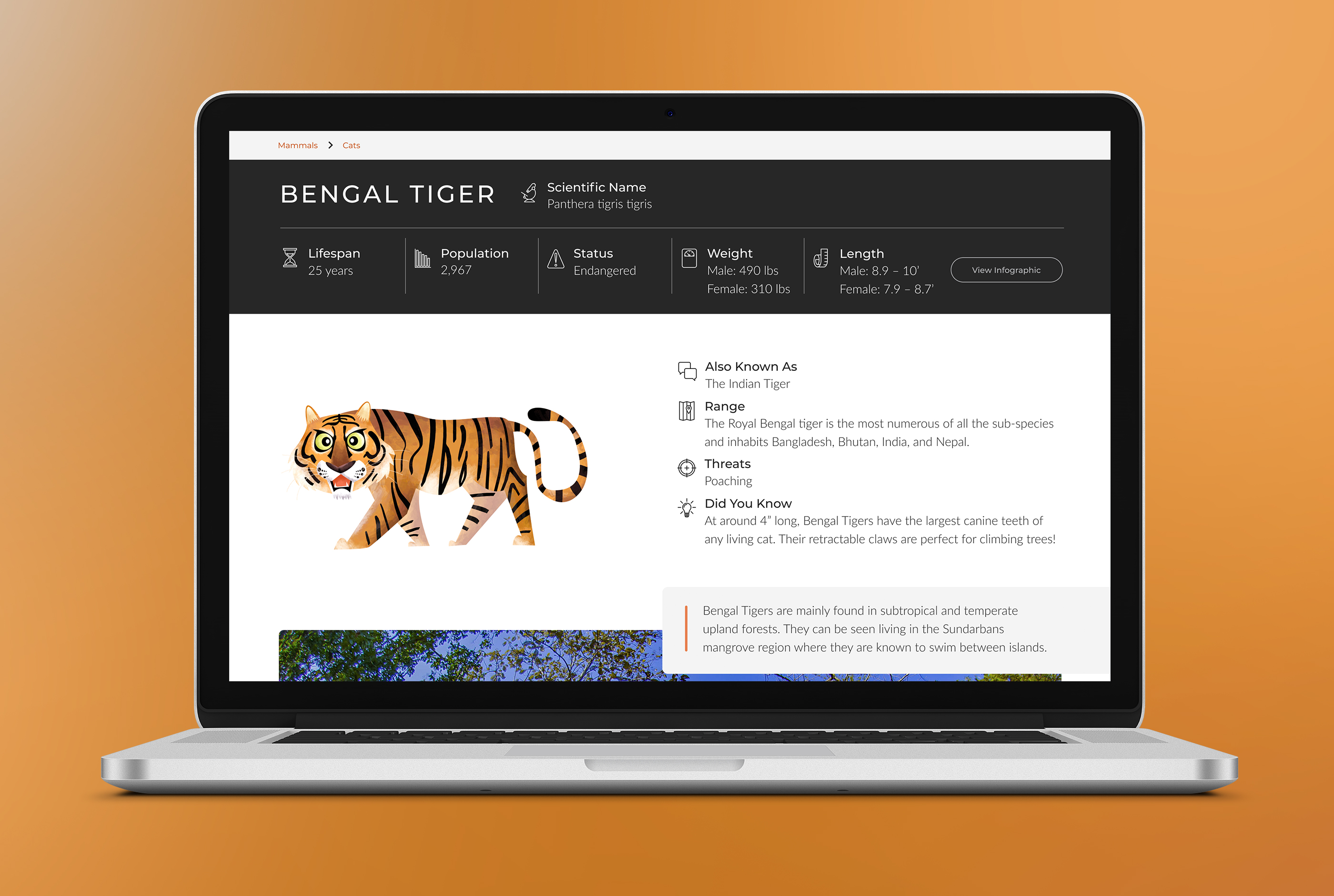
In addition to wanting the pages to look more dynamic and easier to navigate, they wanted a place to show some general information about the species. Their content team did research on the most searched terms related to animals and composed a list of the top ten; Scientific Name, Lifespan, Population, Status, Weight, Length, Also known as, Range, Threats, and Did you know. I designed icons for each of these specs to use on the page.
Creating pages on RoundGlass with some or all of these terms would improve SEO for Sustain pages, but not all of this information would be available for all of the species, so I had to come up with a layout where all of the information would fit, but it wouldn’t look bad if not all of the information was shown.
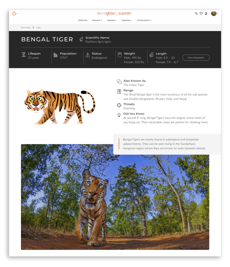

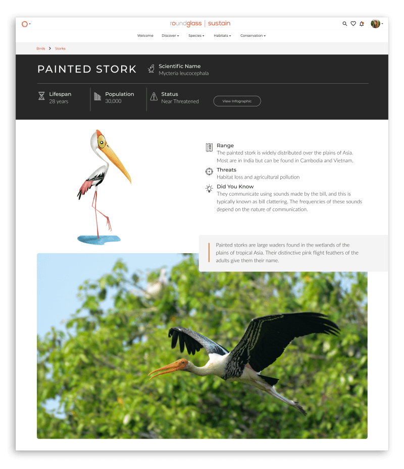
I met with the developers who would be creating this template about the technical requirements. They let me know that they could create a backend solution where the content team could input all of the animal characteristic, a short bio, and a couple of images. Once that information is submitted the page would be automatically generated with the layout I created. The layout would need to work for a variety of animals with a broad range of differences. I also needed to keep all of the spec information in the same general area for the SEO to work properly.

One of the things that the Sustain team wanted incorporate on the page was the info graphics for these animals. The infographics are well designed and interesting to look at, but displaying them on the page would cause a few problems.
They had been commissioned from different designers at different times, so there was no consistency in the size or style of the graphics. The information is also part of the graphic, so it would have to be shown again for the SEO to work effectively. As a compromise, I made a layout that shows the characteristic in a way that makes the top of the page look more like an infographic than if it were just listed in one section. I grouped the icons I designed with each characteristic and arranged them in a way that would allow them to fit together around an image.
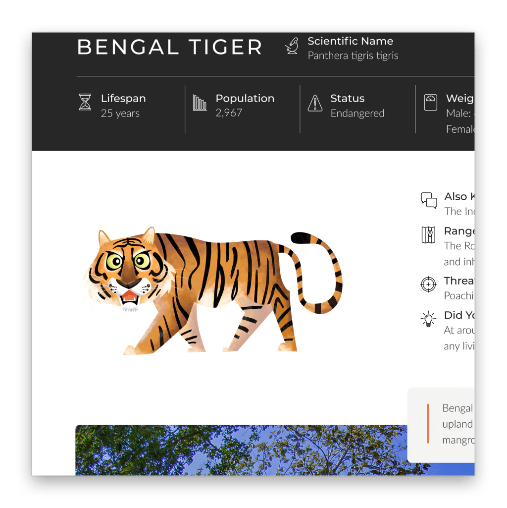
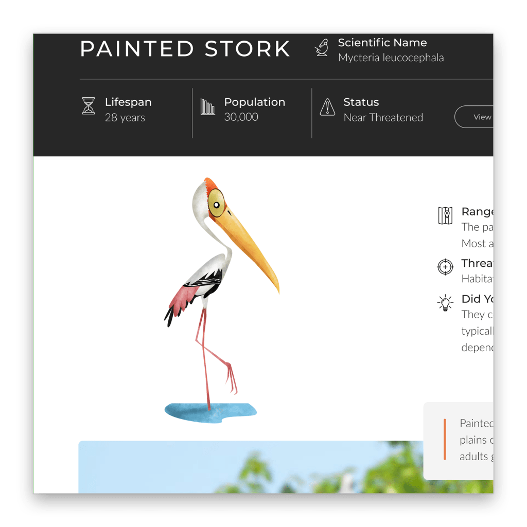
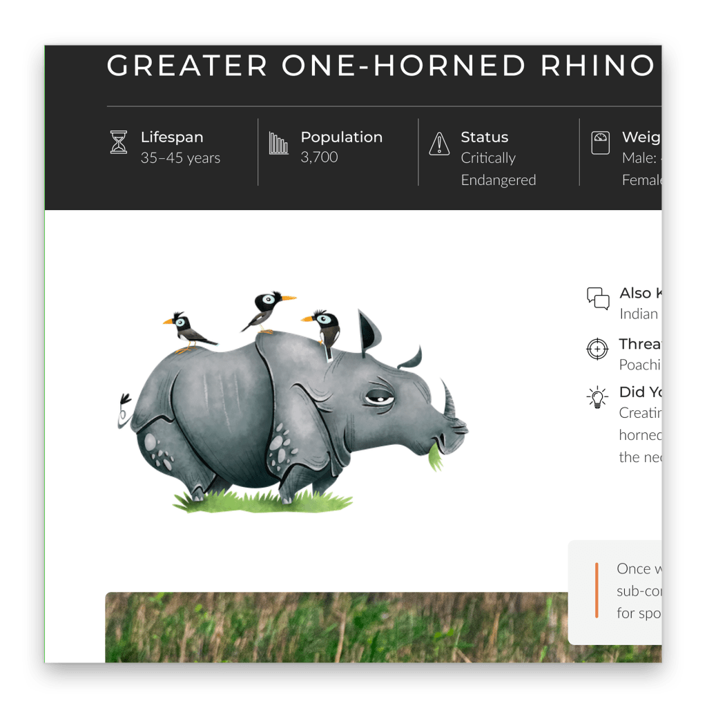
They had also commissioned a designer to do illustrations of each species that they had an infographic for. Because these illustrations were done by one designer, they had the consistent style. Using them as the primary image with the highly custom layout and a link to view the infographic was was my alternative to showing the infographics and the Sustain team was happy with the compromise.
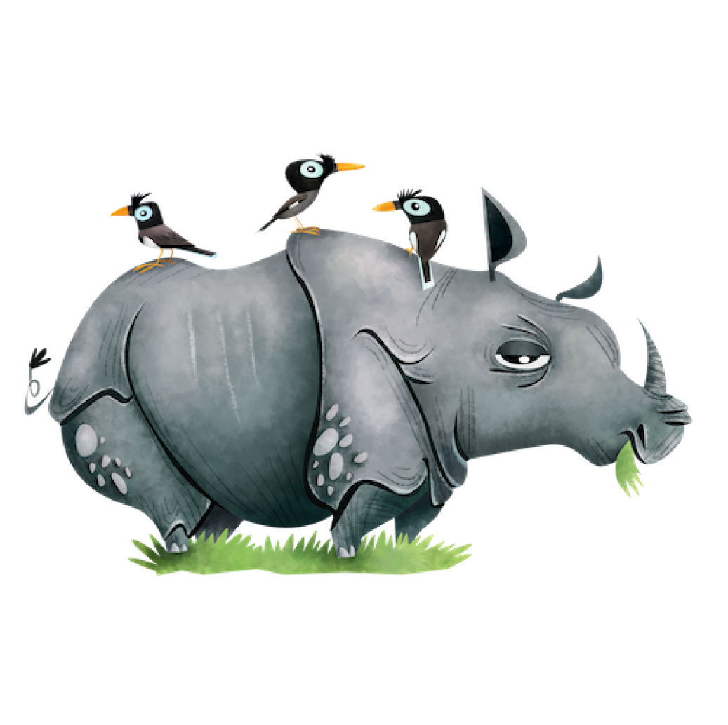
The problem this caused for me in the layout resulted because of the orientation of these illustrations. Animals are different shapes, by nature, so the illustrations are tall and skinny, short and wide, and everywhere in between. To account for the different spacing that would occur around different illustrations, I packed the surrounding elements tightly around them. Since there is already a lot of negative space in the illustration files, I used that space instead of adding padding so one layout would work for all of the animals.
On desktop, specs that require longer answers frame the illustrations on the right with the section for bio cutting into the full width hero image. I chose to overlap the bio on the image to give the page a more editorial appearance, even though the pages are automatically generated.
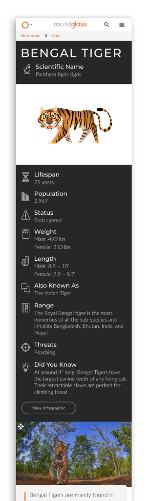
You can view a full mobile page here.
