When I started at Amazon Music, there were strict limitations on using illustration in the Amazon corporate style guide. When we made graphics to promote playlists for activities, we would buy stock photos to include in the designs. Using stock photos for these graphics posed a few problems. Finding good photos was very time consuming, we had little control over the layout, it was difficult to establish consistency, costs added up quickly, and we would often see other brands using photos we had selected. In 2017, when Amazon lifted restrictions on using illustration, I developed a scalable system using original illustrations instead of stock photos.
Testing
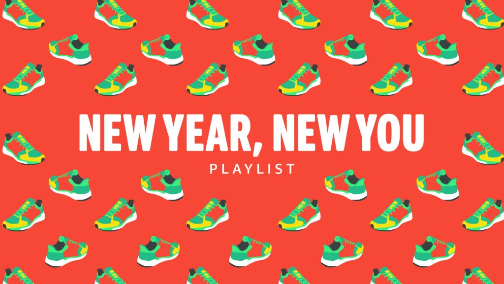
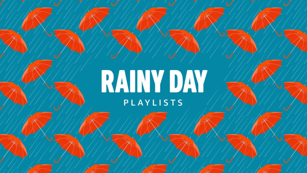
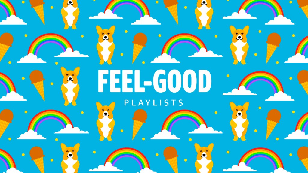
To justify the change, I had to be able to make these graphics quickly. By creating repeating patterns with objects associated to the activities, I was able to make a repository of objects that I illustrated in the same style. I worked with the engagement marketing team to set up an A/B test using a stock photo and an illustrated pattern to get some data on what customers preferred. The click-through-rate showed significantly more engagement with the illustrations, so we implemented the new system within two weeks. As I added more objects to the repository, production time was reduced because I could reuse objects for similar activities.


Stylistic Shift
Originally, I created the illustrations by hand drawing the objects, scanning them and then live tracing them in Illustrator before adding color. I could produce these illustrations quickly, and the and hand drawn aesthetic fit in nicely with the friendly and approachable way that Amazon Music communicated with customers in the Prime Music tier.
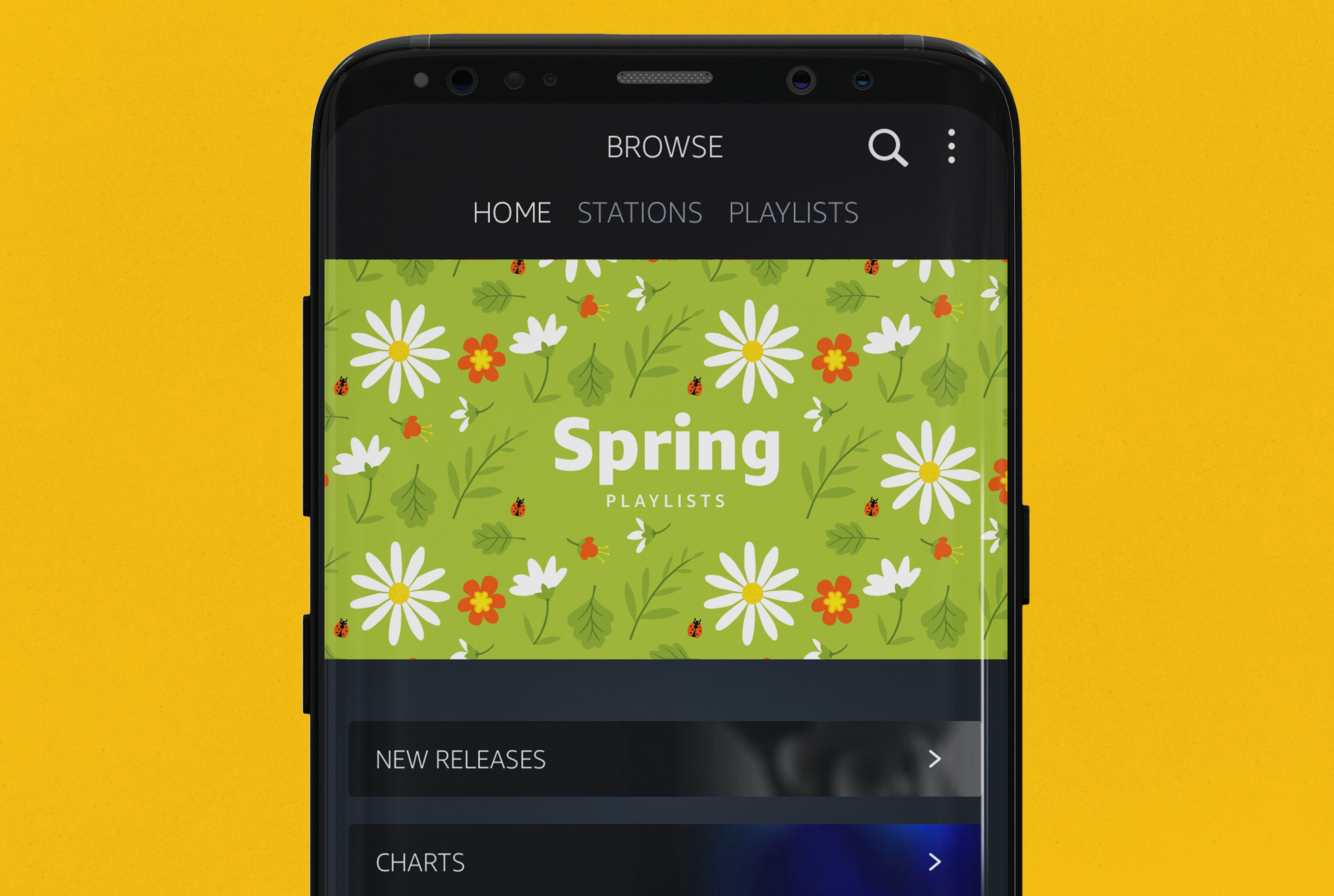
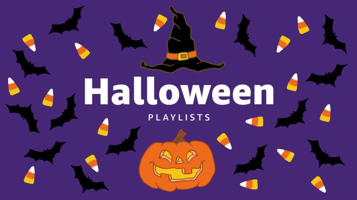
A year into using this process, a had gotten buy in from the whole design team to incorporate illustration into graphics for Amazon Music Unlimited customers as well. We had just rebranded the acquisition graphics for the stand alone service with bright colors and crisp lines, so we decided to replace the hand drawn style with a more flat and geometric approach. I rebuilt the repository in the new style and began using our newly designed brand font.

This marketing placement was ultimately eliminated in a subsequent app redesign when more content became available to Prime Music customers. However, this project laid the groundwork for the complex illustration system that Amazon Music uses now.